Top 5 Benefits of Responsive ColdFusion Web Designs in Los Angeles
Posted Jun. 7, 2025 by Full Blown Web Designs

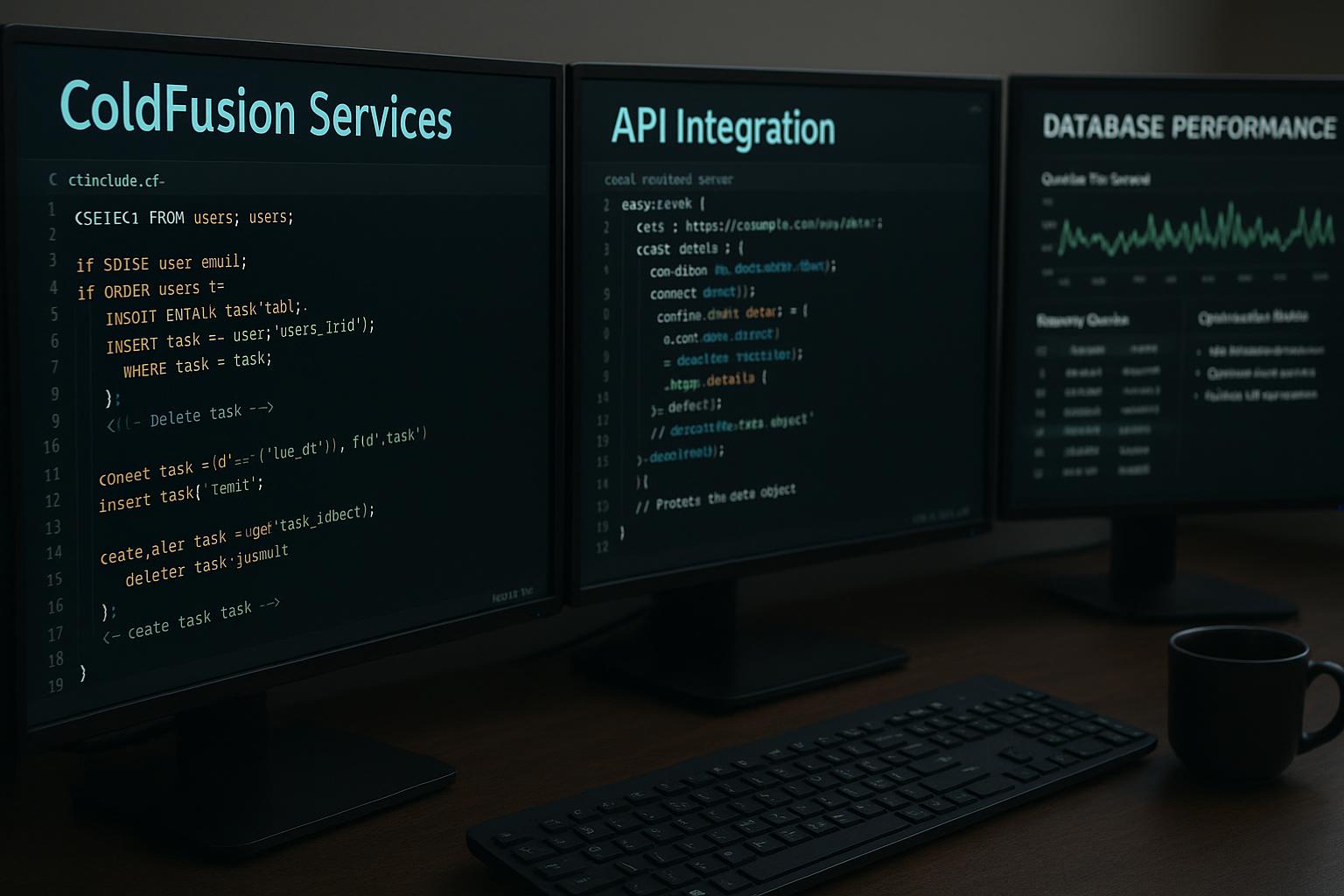
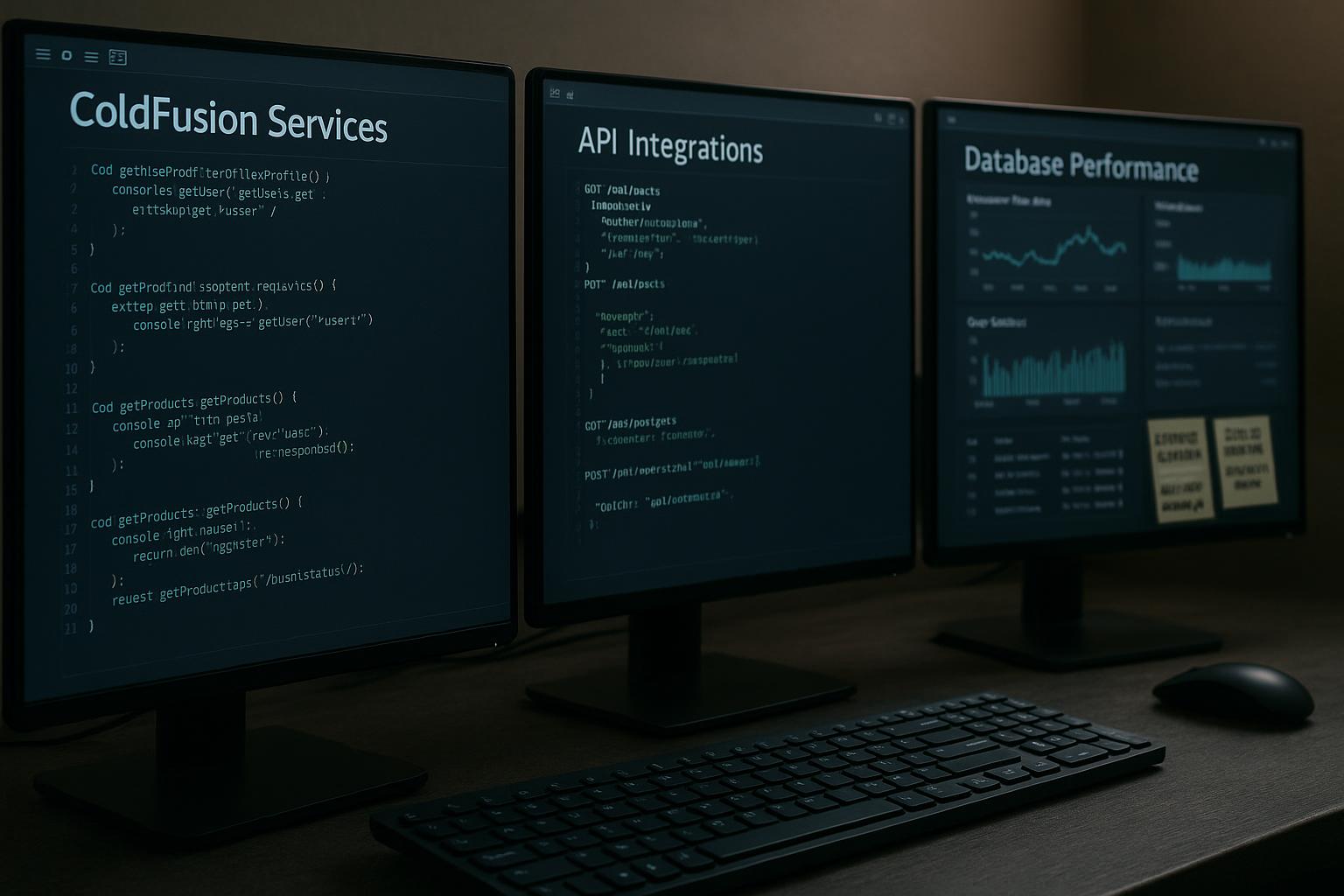
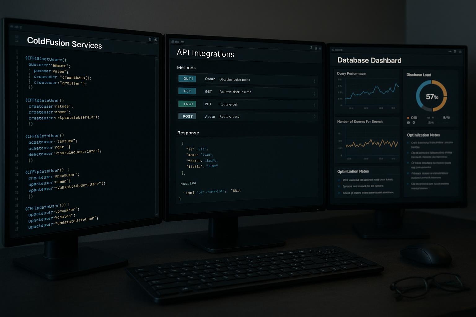
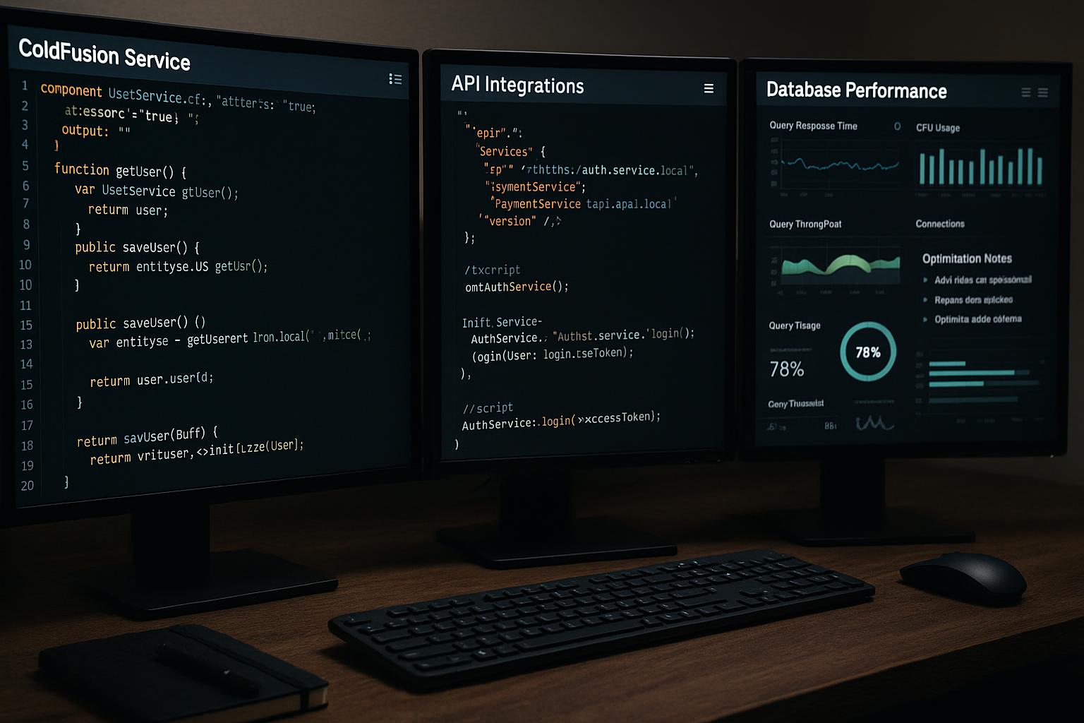
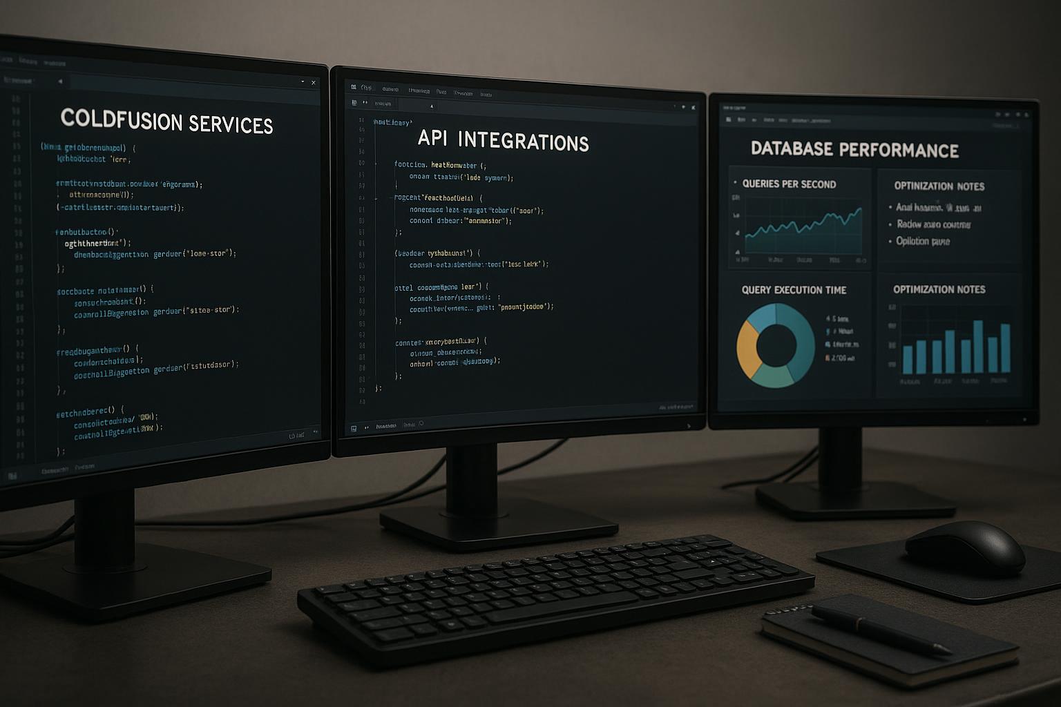
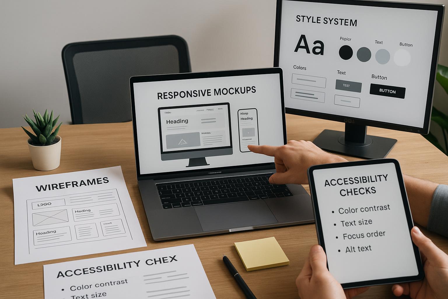
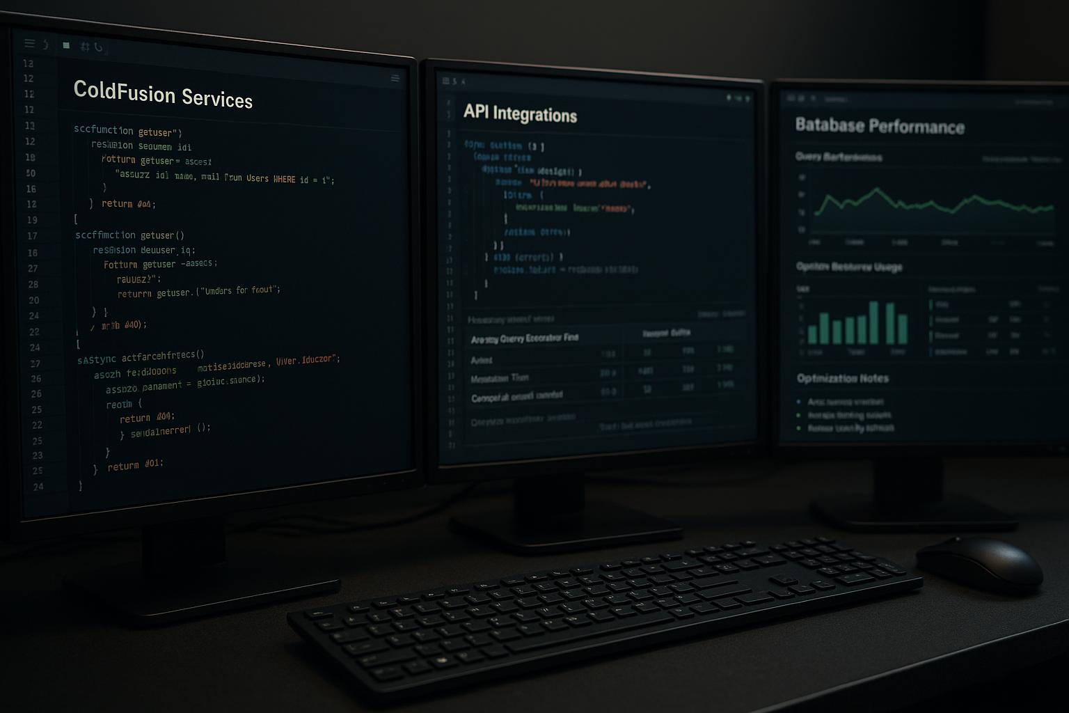
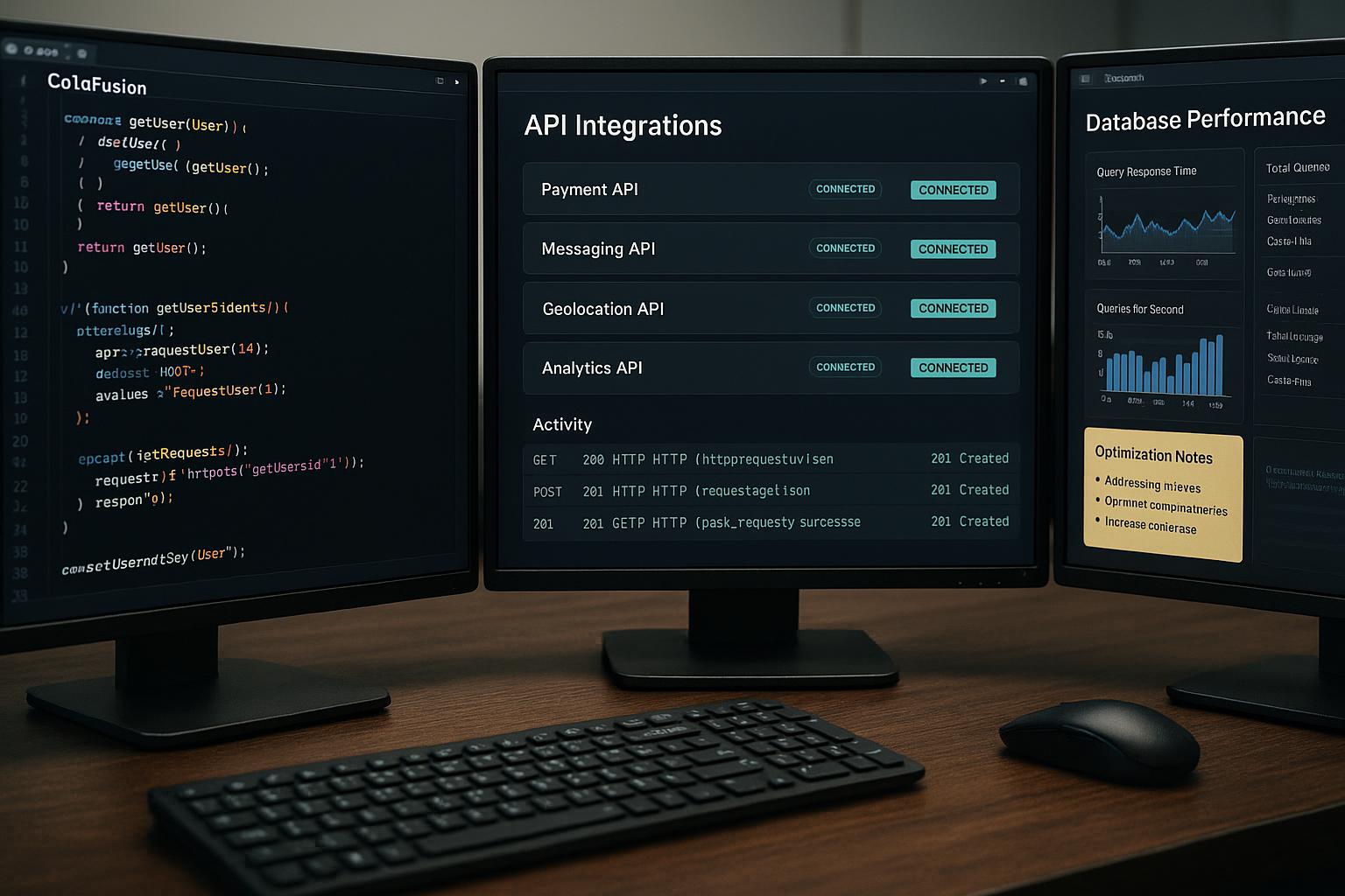
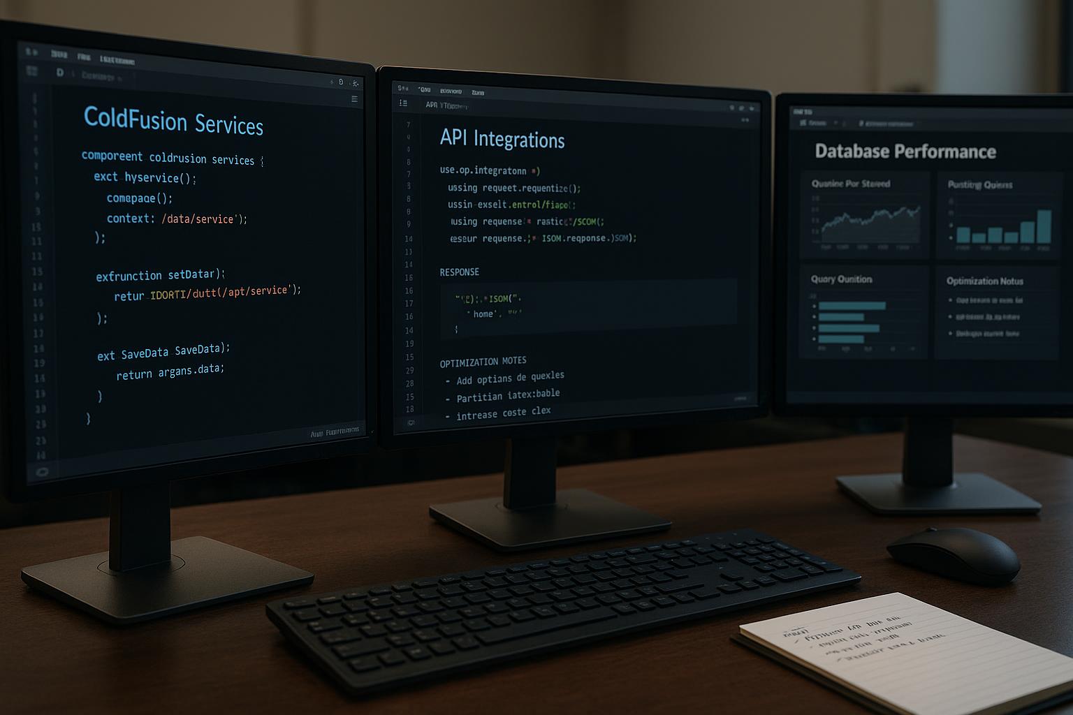
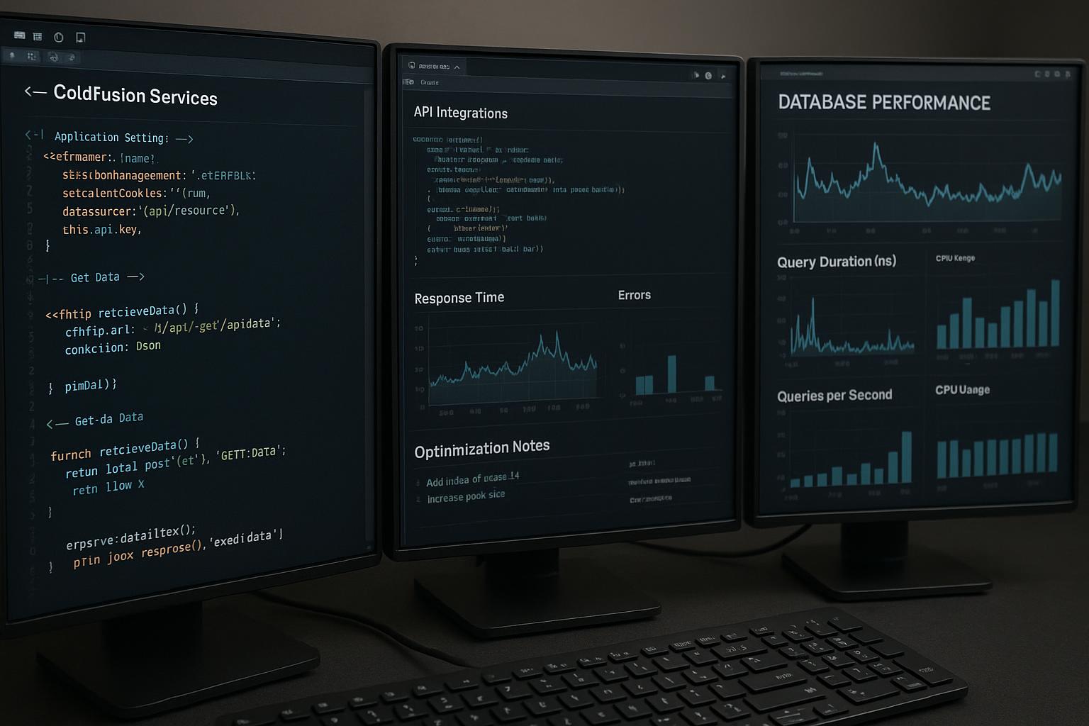
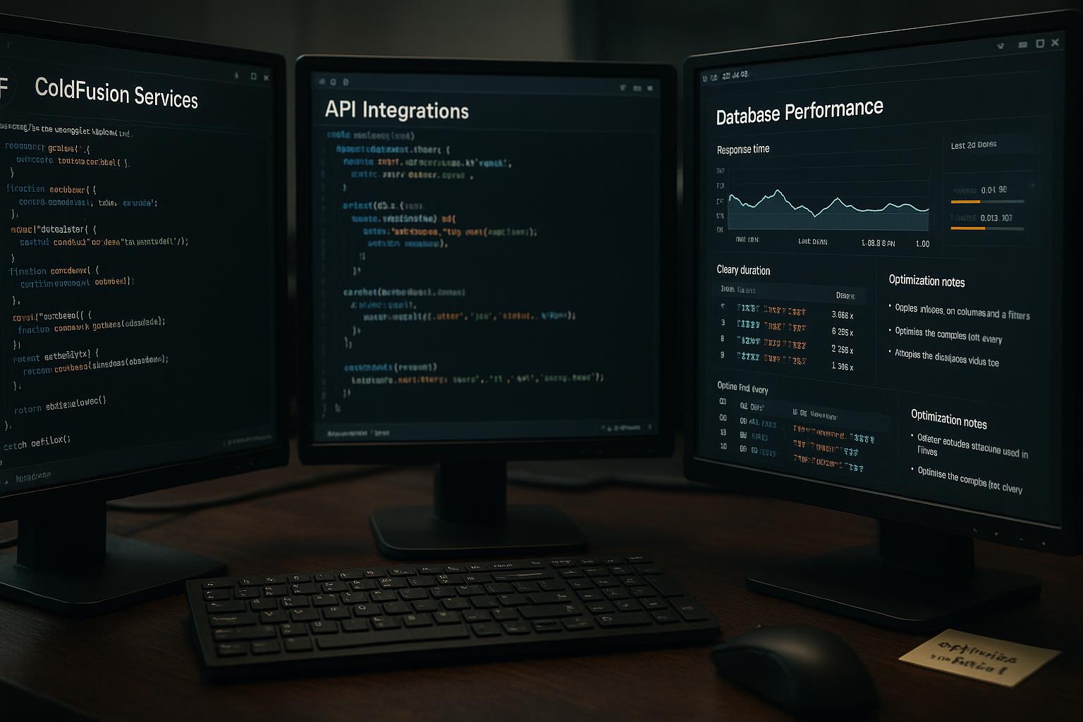
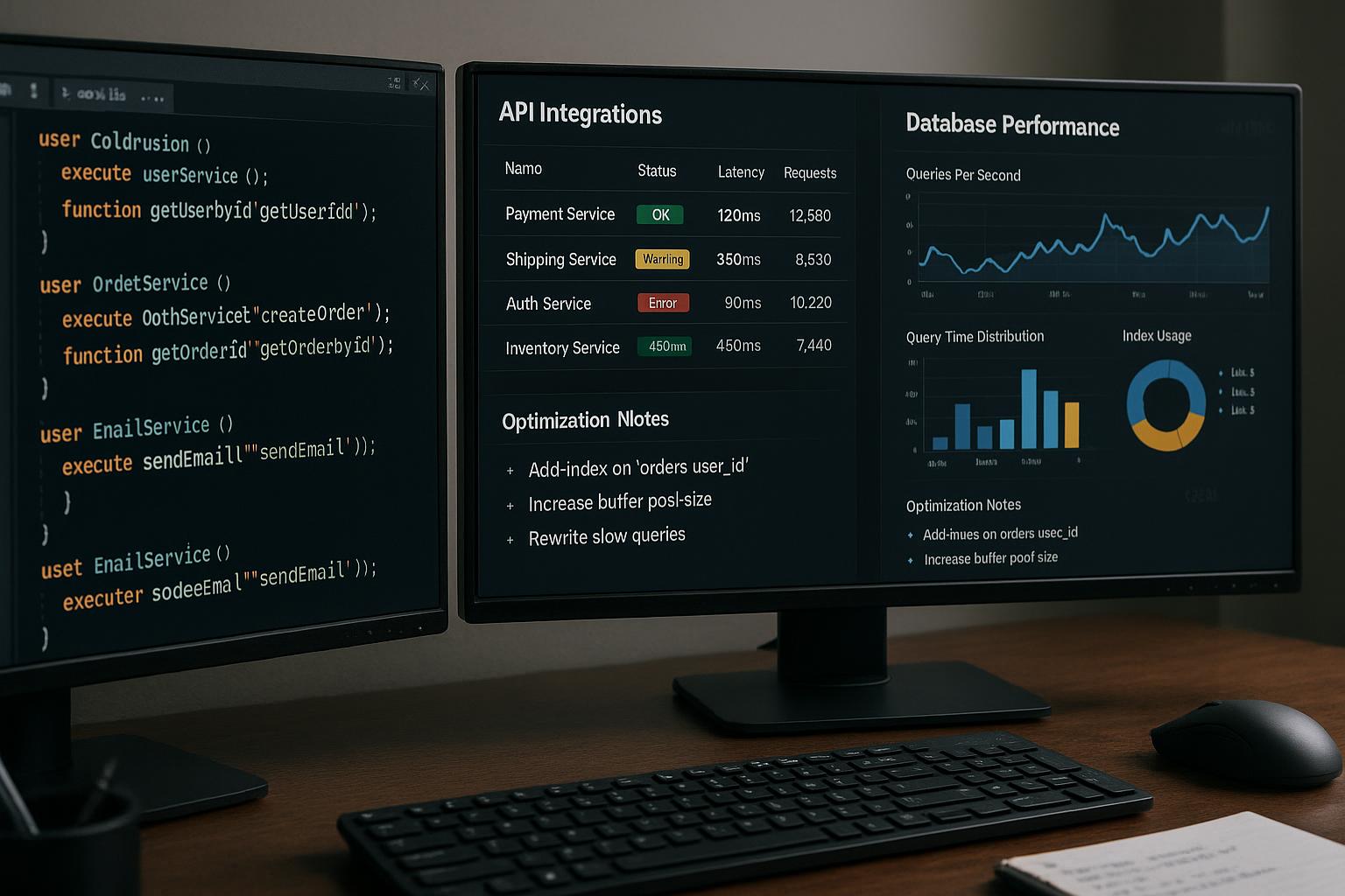
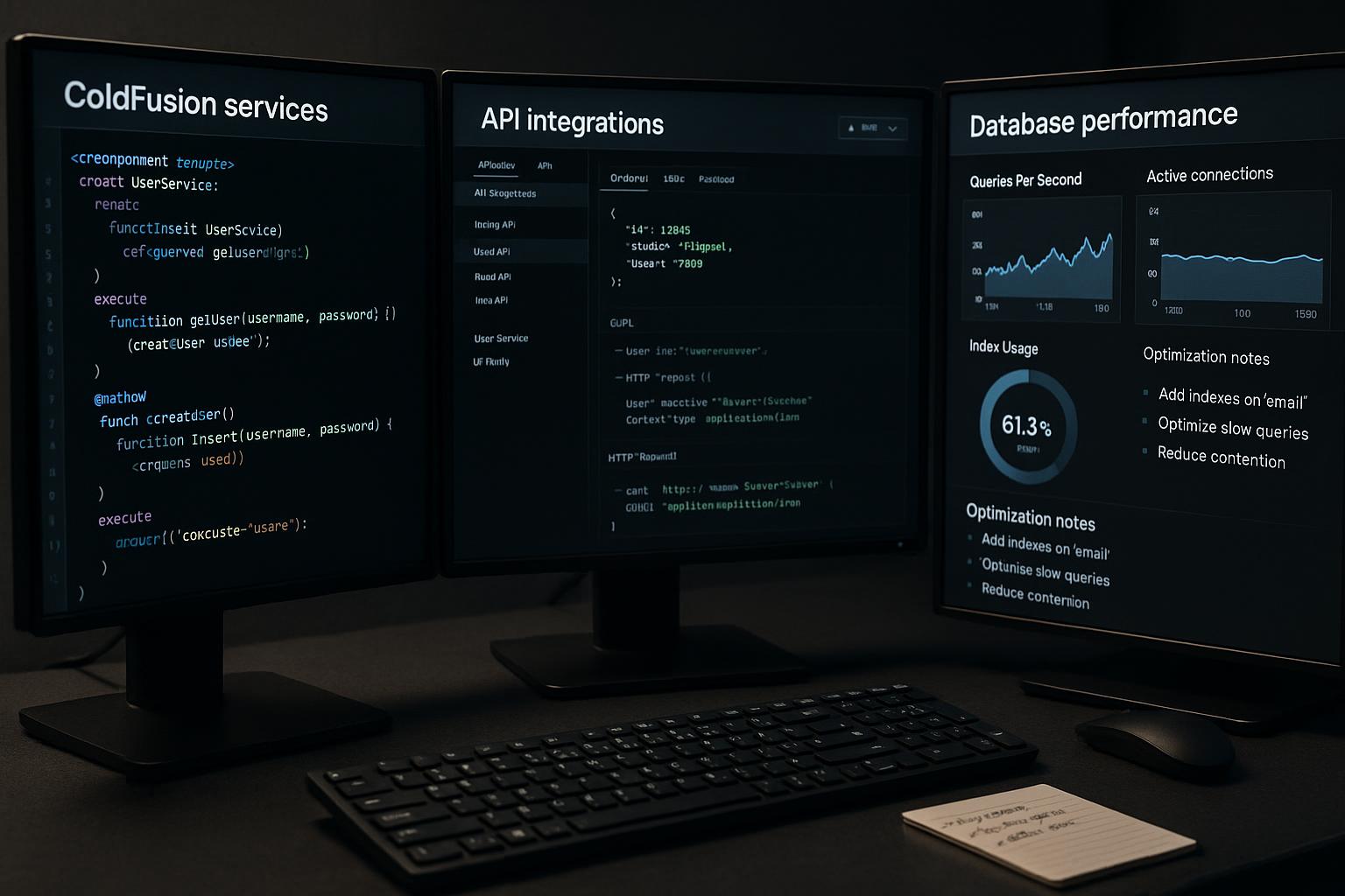
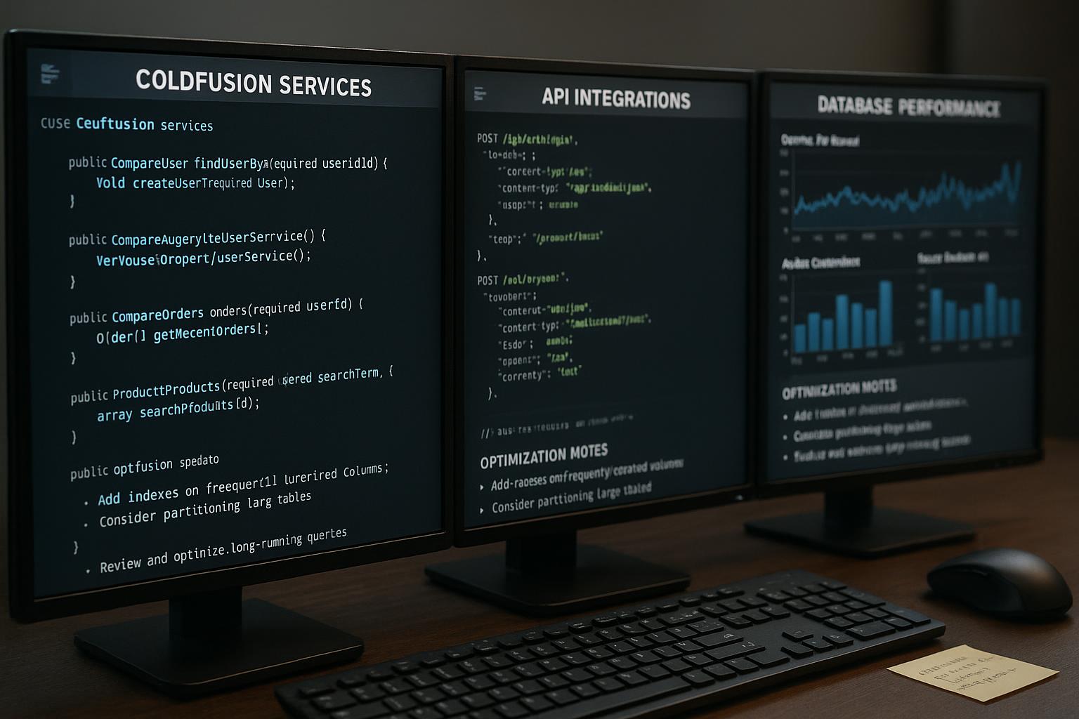
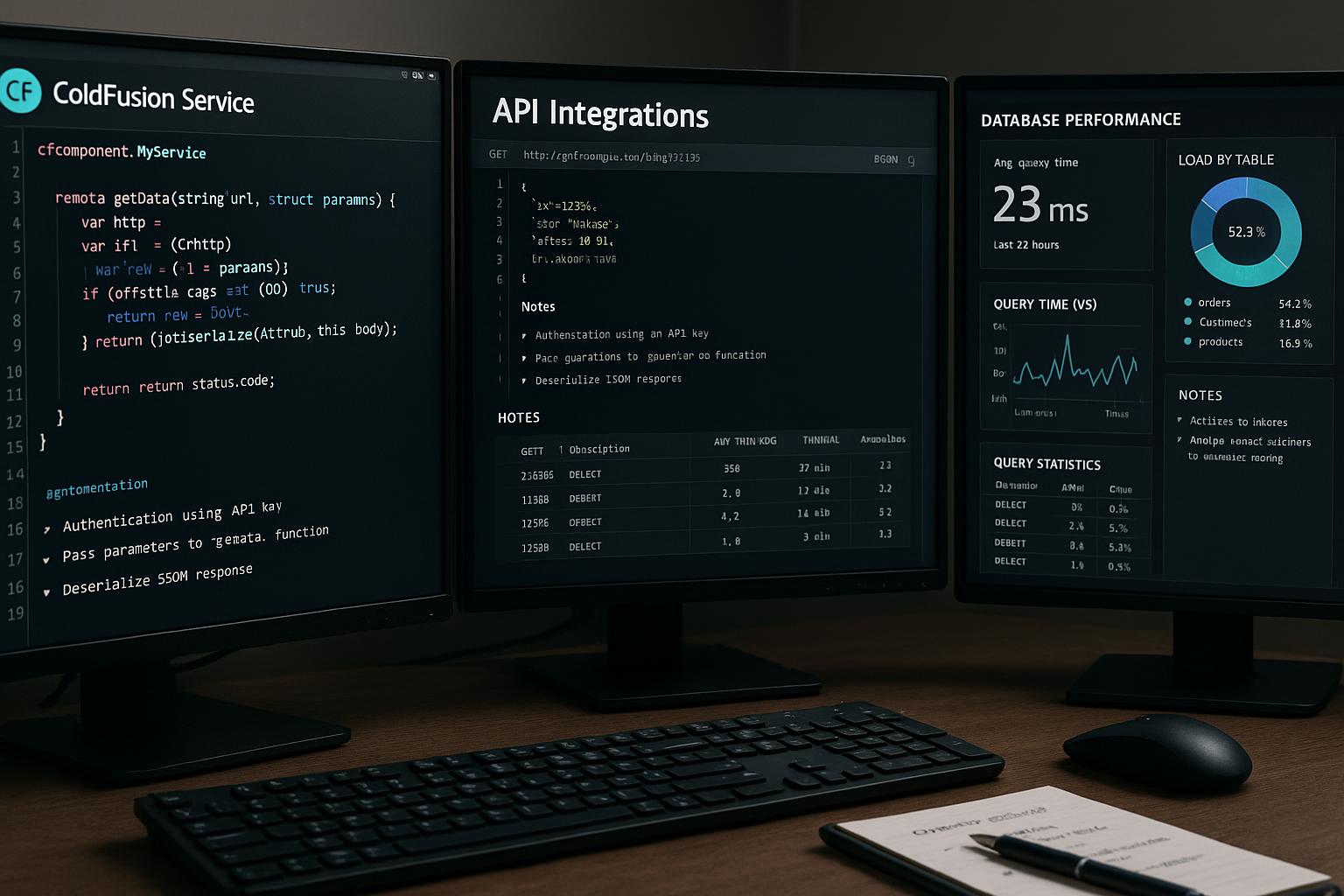
Understanding the Advantages of Responsive ColdFusion Web Designs
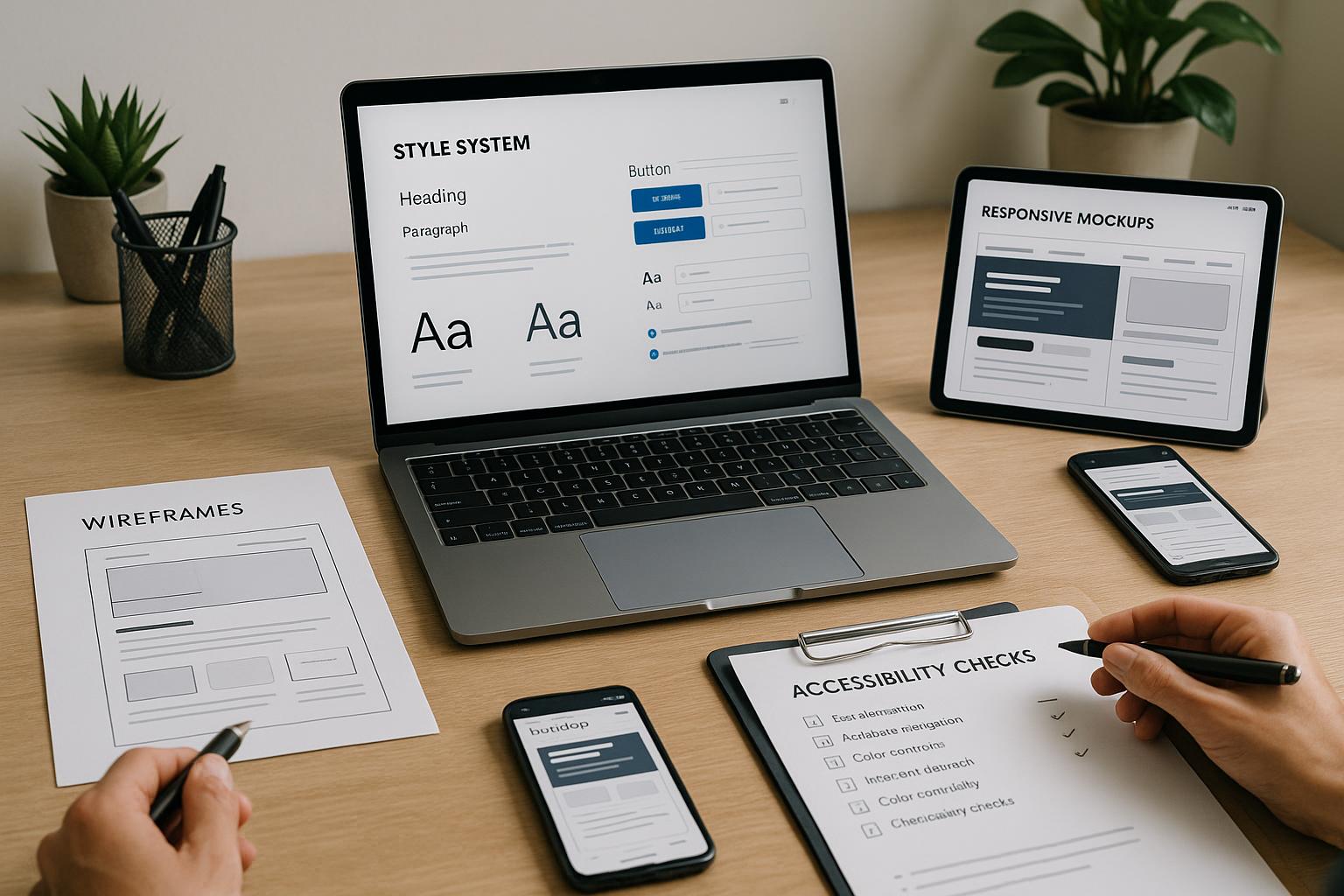
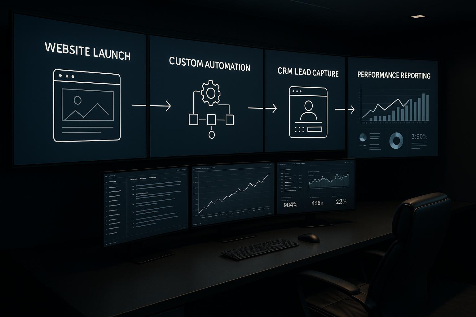
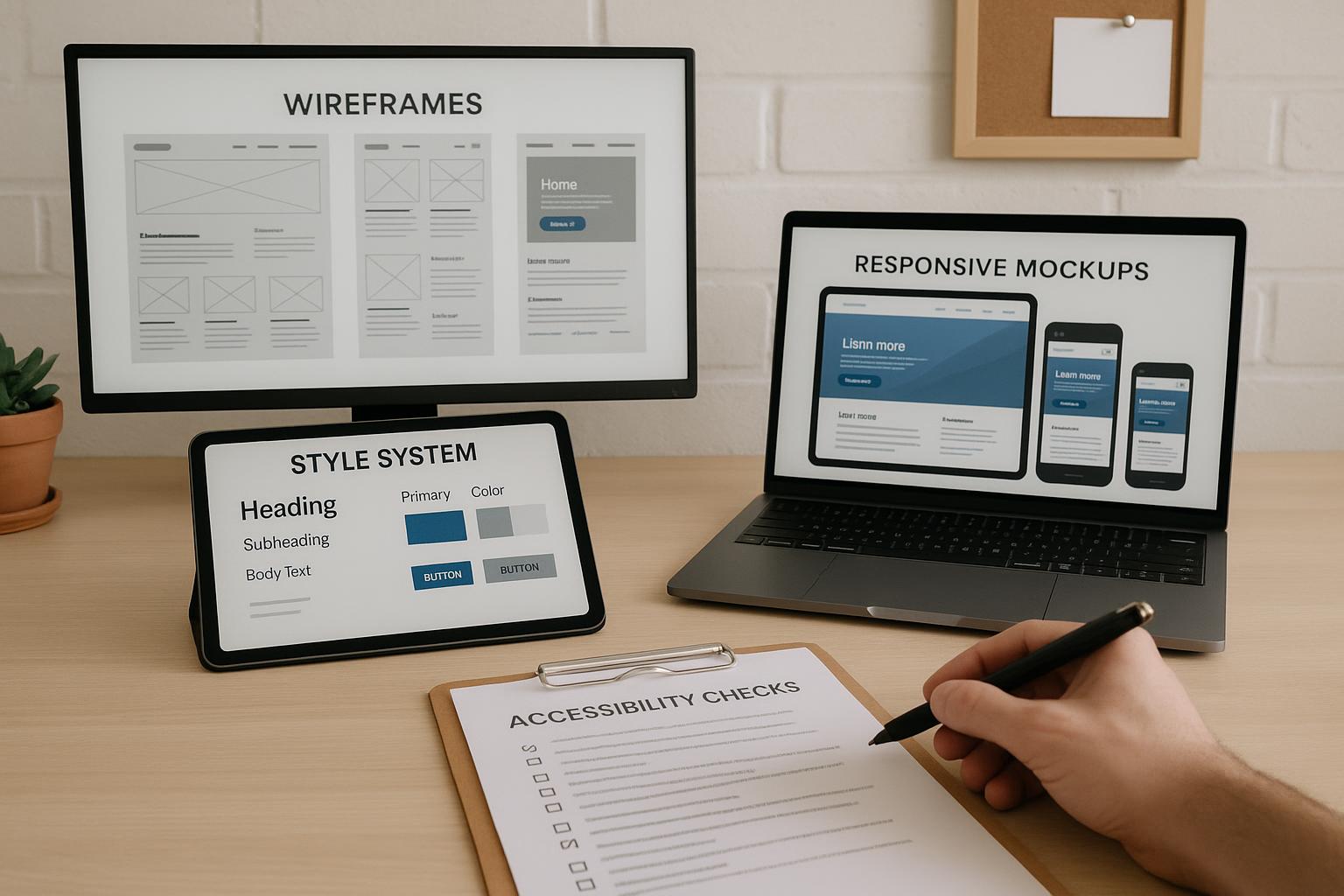
In today’s digital landscape, having a website that adapts seamlessly across different devices is crucial. Businesses in Los Angeles are increasingly recognizing the importance of Responsive ColdFusion Web Designs to enhance user experience and boost engagement. This blog post explores the top five benefits of these dynamic web designs, showcasing how they can elevate your online presence.
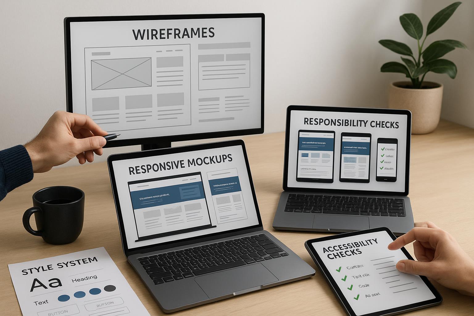
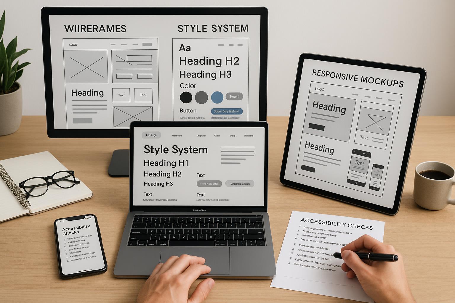
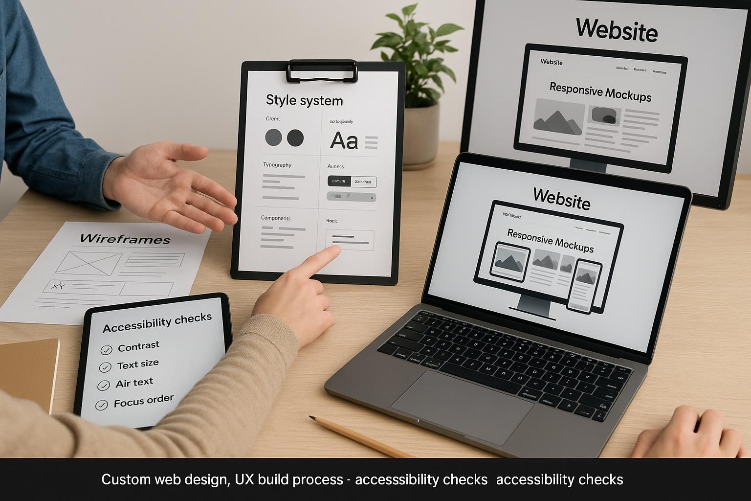
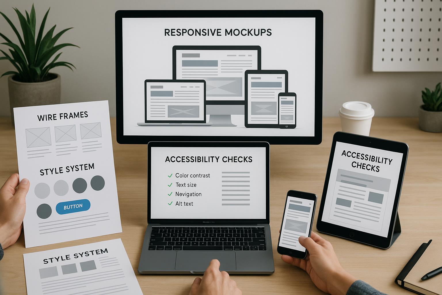
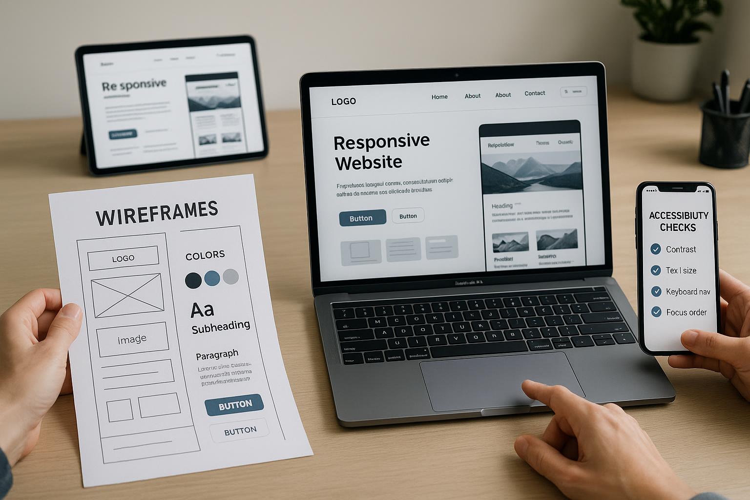
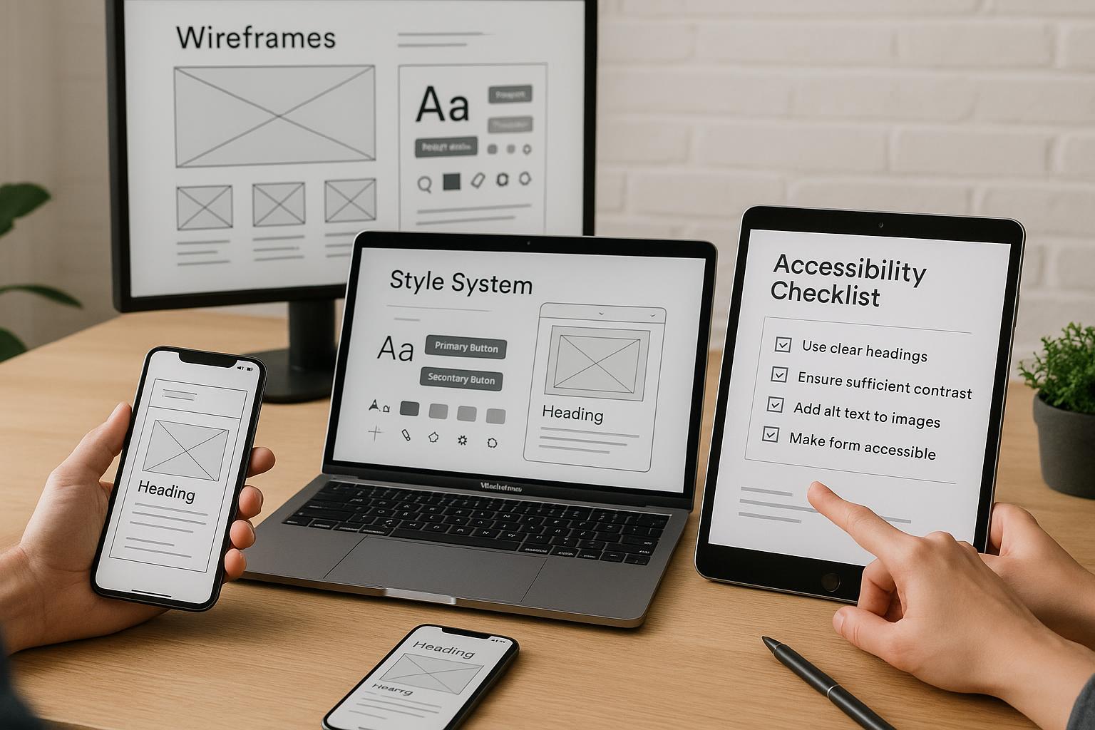
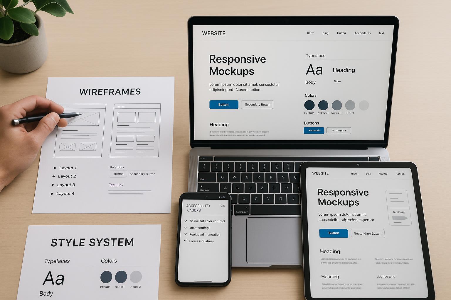
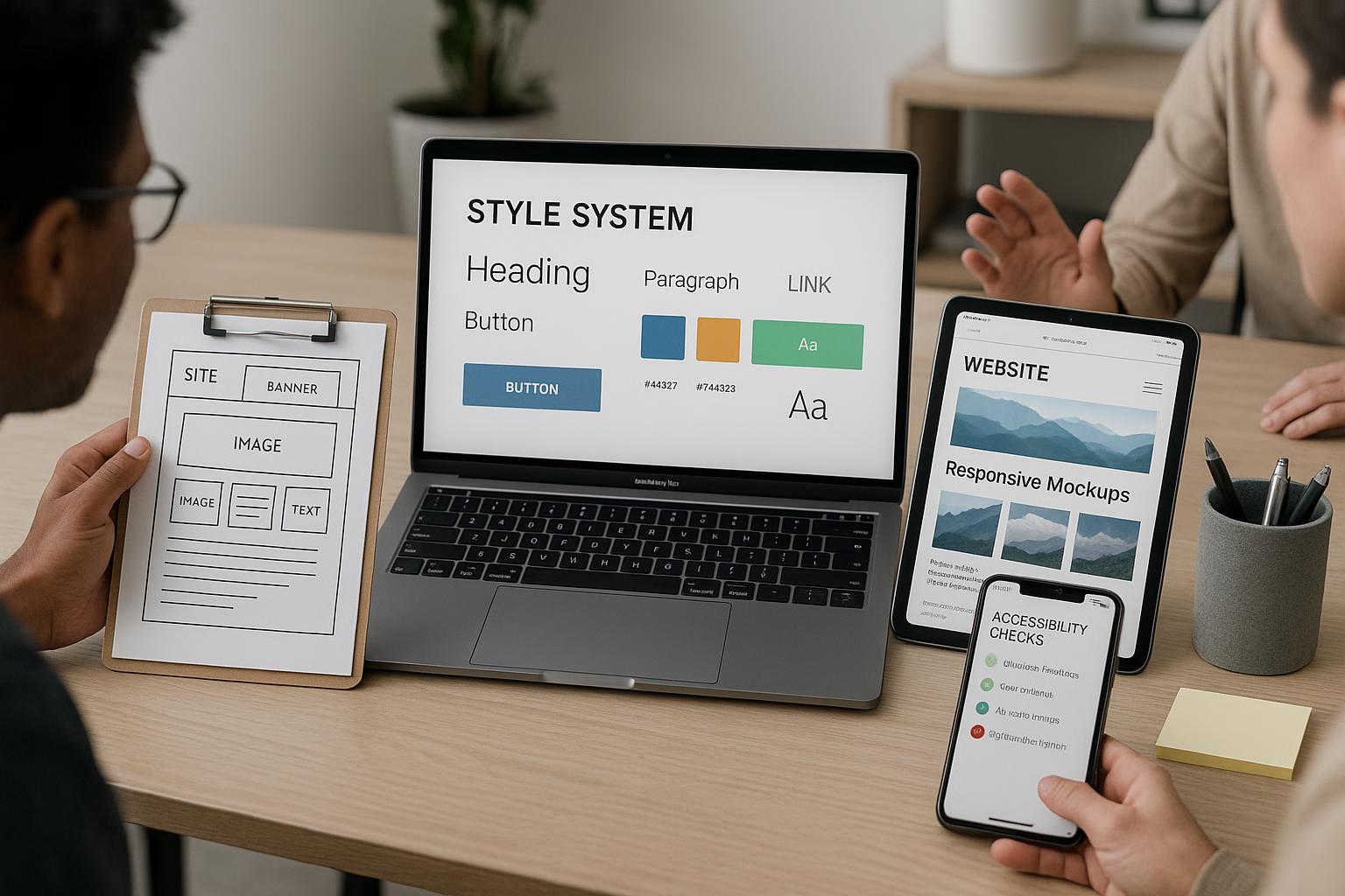
1. Enhanced User Experience
One of the primary benefits of Responsive ColdFusion Web Designs is the improved user experience they offer. A responsive design automatically adjusts to fit the screen size of the device being used, whether it’s a desktop, tablet, or smartphone. This ensures that your content is easily accessible and navigable, leading to higher user satisfaction. Here are some actionable steps to enhance user experience:
- Implement fluid grids to allow for flexible layout adjustments.
- Utilize media queries to optimize CSS for various screen sizes.
- Test your designs on multiple devices to ensure consistency.
2. Improved SEO Performance
Search engines like Google favor websites that are mobile-friendly and responsive. By utilizing Responsive ColdFusion Web Designs, your site is more likely to rank higher in search engine results, which can drive more organic traffic to your business. Consider these steps to enhance your SEO:
- Optimize images and assets for faster loading times.
- Use relevant keywords in your content, titles, and meta tags.
- Ensure your website is indexed correctly by search engines.
3. Cost-Effectiveness
Maintaining multiple versions of a website for different devices can be costly and time-consuming. Responsive ColdFusion Web Designs eliminate the need for separate mobile and desktop sites, allowing for easier management and updates. Here’s how you can save costs:
- Invest in a single responsive design that serves all devices.
- Reduce development and maintenance costs by consolidating your web presence.
- Utilize a Content Management System (CMS) that supports responsive design.
4. Increased Conversion Rates
Responsive designs can significantly impact your conversion rates. A well-structured, easy-to-navigate website encourages users to take action, whether that’s making a purchase or signing up for a newsletter. Here are actionable steps to boost your conversion rates:
- Incorporate clear calls-to-action (CTAs) that stand out.
- Streamline the checkout process for e-commerce sites.
- Use A/B testing to find the most effective design elements.
5. Future-Proofing Your Website
The digital landscape is constantly evolving, with new devices and technologies emerging regularly. Responsive ColdFusion Web Designs ensure that your website remains relevant and functional, regardless of future changes in technology. To future-proof your website:
- Regularly update your design to incorporate new trends and technologies.
- Monitor analytics to understand user behavior and adapt accordingly.
- Stay informed about advancements in web development and design.
Real-World Examples of Responsive ColdFusion Web Designs
Several Los Angeles businesses have successfully implemented Responsive ColdFusion Web Designs to enhance their online presence. For instance, a local e-commerce store saw a 40% increase in sales after transitioning to a responsive design that improved mobile accessibility. Similarly, a service-based company experienced a marked improvement in user engagement and reduced bounce rates after adopting a responsive framework, showcasing the tangible benefits of modern web design.
Frequently Asked Questions
1. What is ColdFusion? ColdFusion is a web application development platform that allows developers to create dynamic and interactive websites. It simplifies the development process by providing robust tools for connecting to databases and handling server-side logic. 2. How does responsive design work? Responsive design uses flexible grids, layouts, and media queries to ensure that a website looks good on all devices. The design adjusts based on the screen size, orientation, and resolution, providing an optimal viewing experience. 3. Can I update my current website to be responsive? Yes, existing websites can be updated to be responsive. This involves reworking the CSS and HTML to ensure compatibility with various devices and screen sizes. 4. How long does it take to create a responsive website? The timeframe for developing a responsive website varies based on the complexity and size of the project. However, most projects can be completed within a few weeks to a few months. 5. Why should I choose Full Blown Web Designs for my project? Full Blown Web Designs offers expert-level web developers, certified ColdFusion developers, top-level graphic designers, and database experts with experience in creating responsive designs tailored to your business needs.Contact Full Blown Web Designs
Choosing to invest in Responsive ColdFusion Web Designs can significantly benefit your business in Los Angeles. With enhanced user experience, improved SEO performance, cost-effectiveness, increased conversion rates, and future-proofing, the advantages are clear. At Full Blown Web Designs, our team of experts is dedicated to delivering high-quality, responsive web solutions tailored to your specific needs. For more information, please contact us at support@fullblown.com or call (661) 429-0940. Let us help you elevate your online presence today!
Top Blog Posts
 July 14, 2026
Custom Membership Websites that Accelerate Leads, Conversions, Speed, Rankings, and ROI
July 14, 2026
Custom Membership Websites that Accelerate Leads, Conversions, Speed, Rankings, and ROI

 July 13, 2026
Web Design Agency Palmdale drives leads, conversions, faster load times, higher rankings, ROI
July 13, 2026
Web Design Agency Palmdale drives leads, conversions, faster load times, higher rankings, ROI


 July 10, 2026
Web Design Encino Delivers Higher Leads, Conversions, Faster Load Times, Rankings, ROI
July 10, 2026
Web Design Encino Delivers Higher Leads, Conversions, Faster Load Times, Rankings, ROI
 July 10, 2026
Web Design Malibu that Generates Leads, Boosts Conversions, Speeds ROI, Elevates Rankings
July 10, 2026
Web Design Malibu that Generates Leads, Boosts Conversions, Speeds ROI, Elevates Rankings


 July 8, 2026
Custom ColdFusion Web Design Services that Drive Leads, Conversions, Site Speed, Rankings, ROI
July 8, 2026
Custom ColdFusion Web Design Services that Drive Leads, Conversions, Site Speed, Rankings, ROI
 July 8, 2026
Drive Leads, Conversions, Speed, Rankings, and ROI with Responsive ColdFusion Web Designs
July 8, 2026
Drive Leads, Conversions, Speed, Rankings, and ROI with Responsive ColdFusion Web Designs
 July 7, 2026
Santa Clarita Custom Web Developer drives more leads, conversions, faster load times, rankings, ROI
July 7, 2026
Santa Clarita Custom Web Developer drives more leads, conversions, faster load times, rankings, ROI
 July 7, 2026
Top Web Designers Pacific Palisades Deliver Fast Load Times, Higher Conversions, ROI and Rankings
July 7, 2026
Top Web Designers Pacific Palisades Deliver Fast Load Times, Higher Conversions, ROI and Rankings


 July 5, 2026
Certified ColdFusion Web Programmers Drive Faster Loads, More Leads, Higher ROI and Rankings
July 5, 2026
Certified ColdFusion Web Programmers Drive Faster Loads, More Leads, Higher ROI and Rankings

 July 4, 2026
Top Web Designers Santa Monica Deliver Higher ROI, More Leads, Conversions, and Faster Sites
July 4, 2026
Top Web Designers Santa Monica Deliver Higher ROI, More Leads, Conversions, and Faster Sites

 July 3, 2026
Custom ColdFusion Programming Delivers Faster Conversions, More Leads, Higher ROI, and Rankings
July 3, 2026
Custom ColdFusion Programming Delivers Faster Conversions, More Leads, Higher ROI, and Rankings


 June 30, 2026
Creative Web Designs Santa Clarita that drives leads, conversions, speed, rankings, and ROI
June 30, 2026
Creative Web Designs Santa Clarita that drives leads, conversions, speed, rankings, and ROI
 June 29, 2026
Custom ColdFusion Web Programmer Delivers More Leads, Faster Conversions, Higher ROI and Rankings
June 29, 2026
Custom ColdFusion Web Programmer Delivers More Leads, Faster Conversions, Higher ROI and Rankings

 June 28, 2026
Website Development Santa Clarita Delivers More Leads, Faster Site Speed, Higher Rankings, ROI
June 28, 2026
Website Development Santa Clarita Delivers More Leads, Faster Site Speed, Higher Rankings, ROI

 June 27, 2026
Custom ColdFusion Web Programmer drives leads, conversions, faster load times, rankings, ROI.
June 27, 2026
Custom ColdFusion Web Programmer drives leads, conversions, faster load times, rankings, ROI.

 June 25, 2026
Top Web Designers Palmdale Deliver Faster Sites, More Leads, Conversions, Rankings, ROI
June 25, 2026
Top Web Designers Palmdale Deliver Faster Sites, More Leads, Conversions, Rankings, ROI

 June 23, 2026
Web Designers Santa Clarita Build Faster Sites to Grow Leads, Conversions, Rankings, and ROI
June 23, 2026
Web Designers Santa Clarita Build Faster Sites to Grow Leads, Conversions, Rankings, and ROI
 June 23, 2026
Top Web Designers Santa Monica Deliver More Leads, Faster Conversions, Higher Rankings, ROI
June 23, 2026
Top Web Designers Santa Monica Deliver More Leads, Faster Conversions, Higher Rankings, ROI

 June 22, 2026
Creative Web Designs Santa Clarita Drives Leads, Conversions, Rankings, Site Speed, and ROI
June 22, 2026
Creative Web Designs Santa Clarita Drives Leads, Conversions, Rankings, Site Speed, and ROI

 June 20, 2026
Santa Clarita Web Design Agency delivers faster site speed, higher ROI, and more leads
June 20, 2026
Santa Clarita Web Design Agency delivers faster site speed, higher ROI, and more leads
 June 19, 2026
Drive Leads, Rankings, and ROI with Custom ColdFusion Web Design Services for Faster Conversions
June 19, 2026
Drive Leads, Rankings, and ROI with Custom ColdFusion Web Design Services for Faster Conversions

 June 18, 2026
Santa Clarita Web Design Agency Delivers Faster Sites, Higher Rankings, Leads, Conversions, ROI
June 18, 2026
Santa Clarita Web Design Agency Delivers Faster Sites, Higher Rankings, Leads, Conversions, ROI


 June 15, 2026
Search Engine Optimization that accelerates rankings, boosts leads, site speed, and ROI
June 15, 2026
Search Engine Optimization that accelerates rankings, boosts leads, site speed, and ROI

 June 13, 2026
Why Hiring a Full Stack Programmer Delivers Speed, Leads, Conversions, Rankings, and ROI
June 13, 2026
Why Hiring a Full Stack Programmer Delivers Speed, Leads, Conversions, Rankings, and ROI

 June 12, 2026
How Santa Clarita Custom Web Developer Delivers Higher Conversions, Faster ROI, and Top Rankings
June 12, 2026
How Santa Clarita Custom Web Developer Delivers Higher Conversions, Faster ROI, and Top Rankings
 June 12, 2026
Coldfusion Web Designs Santa Clarita Drives Leads, Conversions, Site Speed, Rankings, ROI
June 12, 2026
Coldfusion Web Designs Santa Clarita Drives Leads, Conversions, Site Speed, Rankings, ROI
 June 11, 2026
Creative Web Designs Santa Clarita boost leads, conversions, site speed, rankings, and ROI
June 11, 2026
Creative Web Designs Santa Clarita boost leads, conversions, site speed, rankings, and ROI


 June 9, 2026
ColdFusion Web Designs Boost Leads, Conversions, Speed, Rankings, ROI for Your Business
June 9, 2026
ColdFusion Web Designs Boost Leads, Conversions, Speed, Rankings, ROI for Your Business

 June 7, 2026
What a ColdFusion Programmer for Custom Web Development Delivers: Leads, Conversions, Speed, Rankings, ROI
June 7, 2026
What a ColdFusion Programmer for Custom Web Development Delivers: Leads, Conversions, Speed, Rankings, ROI

 June 6, 2026
ColdFusion Web Design and Hosting for Higher Rankings, Faster Conversions, More Leads, and ROI
June 6, 2026
ColdFusion Web Design and Hosting for Higher Rankings, Faster Conversions, More Leads, and ROI


 June 2, 2026
Coldfusion Web Designs Santa Clarita Accelerates Leads, Conversions, Speed, Rankings, and ROI
June 2, 2026
Coldfusion Web Designs Santa Clarita Accelerates Leads, Conversions, Speed, Rankings, and ROI


 May 30, 2026
Santa Clarita Web Design Firm Drives Leads, Conversions, Rankings, Faster Site Speed, ROI
May 30, 2026
Santa Clarita Web Design Firm Drives Leads, Conversions, Rankings, Faster Site Speed, ROI


 May 28, 2026
Top Web Designers Pacific Palisades Deliver Higher Leads, Faster Conversions, Superior Rankings and ROI
May 28, 2026
Top Web Designers Pacific Palisades Deliver Higher Leads, Faster Conversions, Superior Rankings and ROI
 May 27, 2026
Custom Membership Websites That Accelerate Leads, Conversions, Speed, Rankings, and ROI
May 27, 2026
Custom Membership Websites That Accelerate Leads, Conversions, Speed, Rankings, and ROI

 May 26, 2026
Web Design Agency Santa Clarita Delivers More Leads, Speedy Conversions, ROI, and Rankings
May 26, 2026
Web Design Agency Santa Clarita Delivers More Leads, Speedy Conversions, ROI, and Rankings


 May 20, 2026
Top Web Designers Pacific Palisades Deliver Higher Conversions, Faster Load Times, and ROI
May 20, 2026
Top Web Designers Pacific Palisades Deliver Higher Conversions, Faster Load Times, and ROI


 May 18, 2026
Creative Web Designs Santa Clarita that Drives Leads, Conversions, Speed, Rankings, ROI
May 18, 2026
Creative Web Designs Santa Clarita that Drives Leads, Conversions, Speed, Rankings, ROI


 April 28, 2026
Full Blown Web Designs: Top 5 Web Design Encino Solutions
April 28, 2026
Full Blown Web Designs: Top 5 Web Design Encino Solutions


 April 17, 2026
Full Blown Web Designs: Full Stack Programmer in Los Angeles
April 17, 2026
Full Blown Web Designs: Full Stack Programmer in Los Angeles


 March 28, 2026
Acton Web Designer: Custom Web Designs with ColdFusion, MySQL, Bootstrap & JavaScript
March 28, 2026
Acton Web Designer: Custom Web Designs with ColdFusion, MySQL, Bootstrap & JavaScript


 March 27, 2026
Top Santa Clarita Web Design Agency: Full Blown Web Designs
March 27, 2026
Top Santa Clarita Web Design Agency: Full Blown Web Designs


 March 17, 2026
Web Design Agency Palmdale Full Blown Web Designs for MySQL
March 17, 2026
Web Design Agency Palmdale Full Blown Web Designs for MySQL


 February 27, 2026
Web Design Encino: Top 5 Reasons to Choose Full Blown Web Designs
February 27, 2026
Web Design Encino: Top 5 Reasons to Choose Full Blown Web Designs
 February 27, 2026
Santa Clarita Web Design Agency: Full Blown Web Designs in Los Angeles
February 27, 2026
Santa Clarita Web Design Agency: Full Blown Web Designs in Los Angeles
 February 26, 2026
Full Blown Web Designs: Web Design Agency Santa Clarita Experts
February 26, 2026
Full Blown Web Designs: Web Design Agency Santa Clarita Experts
 February 25, 2026
Responsive ColdFusion Web Designs for Los Angeles: 5 Key Benefits
February 25, 2026
Responsive ColdFusion Web Designs for Los Angeles: 5 Key Benefits
 February 25, 2026
ColdFusion Web Design and Hosting: Full Blown Web Designs in Los Angeles
February 25, 2026
ColdFusion Web Design and Hosting: Full Blown Web Designs in Los Angeles


 February 23, 2026
Acton Web Designer: Full Blown Web Designs Delivers Custom Web Solutions
February 23, 2026
Acton Web Designer: Full Blown Web Designs Delivers Custom Web Solutions
 February 23, 2026
Top Web Designers Santa Monica: Full Blown Web Designs in Los Angeles
February 23, 2026
Top Web Designers Santa Monica: Full Blown Web Designs in Los Angeles

 February 22, 2026
Top Web Designers Pacific Palisades by Full Blown Web Designs
February 22, 2026
Top Web Designers Pacific Palisades by Full Blown Web Designs
 February 21, 2026
Top 5 ColdFusion Web Designs by Full Blown Web Designs in LA
February 21, 2026
Top 5 ColdFusion Web Designs by Full Blown Web Designs in LA
 February 21, 2026
Web Design Agency Santa Clarita: Full Blown Web Designs for Custom Sites
February 21, 2026
Web Design Agency Santa Clarita: Full Blown Web Designs for Custom Sites


 February 18, 2026
Top Web Designers Santa Clarita: Full Blown Web Designs for Custom Web
February 18, 2026
Top Web Designers Santa Clarita: Full Blown Web Designs for Custom Web

 February 17, 2026
Santa Clarita Custom Web Developer: Full Blown Web Designs Experts
February 17, 2026
Santa Clarita Custom Web Developer: Full Blown Web Designs Experts
 February 17, 2026
Top Web Designers Malibu: Full Blown Web Designs in Los Angeles
February 17, 2026
Top Web Designers Malibu: Full Blown Web Designs in Los Angeles
 February 16, 2026
Top 5 Reasons to Hire a Full Stack Programmer in Los Angeles
February 16, 2026
Top 5 Reasons to Hire a Full Stack Programmer in Los Angeles

 February 15, 2026
ColdFusion Web Designs in Los Angeles by Full Blown Web Designs
February 15, 2026
ColdFusion Web Designs in Los Angeles by Full Blown Web Designs
 February 15, 2026
Acton Web Designer: Full Blown Web Designs for Custom Websites in LA
February 15, 2026
Acton Web Designer: Full Blown Web Designs for Custom Websites in LA
 February 14, 2026
Full Blown Web Designs: Custom ColdFusion Programming in Los Angeles
February 14, 2026
Full Blown Web Designs: Custom ColdFusion Programming in Los Angeles
 February 14, 2026
Web Design Pacific Palisades: Full Blown Web Designs, Premier LA Experts
February 14, 2026
Web Design Pacific Palisades: Full Blown Web Designs, Premier LA Experts

 February 13, 2026
Santa Clarita Custom Web Developer: Full Blown Web Designs, LA Experts
February 13, 2026
Santa Clarita Custom Web Developer: Full Blown Web Designs, LA Experts
 February 12, 2026
Web Design Porter Ranch by Full Blown Web Designs - Custom Web Solutions
February 12, 2026
Web Design Porter Ranch by Full Blown Web Designs - Custom Web Solutions
 February 11, 2026
Improve Search Engine Ranking with Full Blown Web Designs in Los Angeles
February 11, 2026
Improve Search Engine Ranking with Full Blown Web Designs in Los Angeles

 February 10, 2026
Web Design Agency Acton: Full Blown Web Designs for Custom LA Websites
February 10, 2026
Web Design Agency Acton: Full Blown Web Designs for Custom LA Websites

 February 9, 2026
Santa Clarita Web Design Firm: Full Blown Custom Web Designs
February 9, 2026
Santa Clarita Web Design Firm: Full Blown Custom Web Designs
 February 8, 2026
Expert ColdFusion Programmer in Los Angeles | Full Blown Web Designs
February 8, 2026
Expert ColdFusion Programmer in Los Angeles | Full Blown Web Designs


 February 6, 2026
Full Blown Web Designs: Responsive ColdFusion Web Designs for LA
February 6, 2026
Full Blown Web Designs: Responsive ColdFusion Web Designs for LA

 February 5, 2026
Web Design Valencia by Full Blown Web Designs – Los Angeles Experts
February 5, 2026
Web Design Valencia by Full Blown Web Designs – Los Angeles Experts


 February 1, 2026
Top Web Designers Pacific Palisades: Full Blown Web Designs, LA
February 1, 2026
Top Web Designers Pacific Palisades: Full Blown Web Designs, LA
 February 1, 2026
Web Designs Valencia: Top 5 Reasons to Choose Full Blown Web Designs
February 1, 2026
Web Designs Valencia: Top 5 Reasons to Choose Full Blown Web Designs


 January 29, 2026
Creative Web Designs in Los Angeles by Full Blown Web Designs
January 29, 2026
Creative Web Designs in Los Angeles by Full Blown Web Designs


 January 25, 2026
Web Design Encino: Top 5 Reasons to Choose Full Blown Web Designs
January 25, 2026
Web Design Encino: Top 5 Reasons to Choose Full Blown Web Designs
 January 25, 2026
Santa Clarita Custom Web Developer: Full Blown Web Designs in LA
January 25, 2026
Santa Clarita Custom Web Developer: Full Blown Web Designs in LA
 January 24, 2026
Full Blown Web Designs: Top Web Designers Santa Clarita in LA
January 24, 2026
Full Blown Web Designs: Top Web Designers Santa Clarita in LA


 January 23, 2026
Creative Web Designs Acton: Top 5 Benefits by Full Blown Web Designs
January 23, 2026
Creative Web Designs Acton: Top 5 Benefits by Full Blown Web Designs
 January 22, 2026
Santa Clarita Web Design Agency: Full Blown Custom Web Designs
January 22, 2026
Santa Clarita Web Design Agency: Full Blown Custom Web Designs


 January 21, 2026
Top Web Designers Santa Clarita: Full Blown Web Designs, MySQL
January 21, 2026
Top Web Designers Santa Clarita: Full Blown Web Designs, MySQL
 January 20, 2026
Acton Web Designer: Custom LA Websites by Full Blown Web Designs
January 20, 2026
Acton Web Designer: Custom LA Websites by Full Blown Web Designs
 January 20, 2026
Top Web Designers Pacific Palisades: Full Blown Web Designs in LA
January 20, 2026
Top Web Designers Pacific Palisades: Full Blown Web Designs in LA

 January 19, 2026
Web Design Porter Ranch: Full Blown Web Designs Custom Web Solutions
January 19, 2026
Web Design Porter Ranch: Full Blown Web Designs Custom Web Solutions

 January 18, 2026
Web Design Encino: Full Blown Web Designs' Custom LA Solutions
January 18, 2026
Web Design Encino: Full Blown Web Designs' Custom LA Solutions

 January 17, 2026
Top Web Designers Acton: Full Blown Web Designs for Custom Websites
January 17, 2026
Top Web Designers Acton: Full Blown Web Designs for Custom Websites


 January 15, 2026
ColdFusion Web Design and Hosting: Full Blown Web Designs LA
January 15, 2026
ColdFusion Web Design and Hosting: Full Blown Web Designs LA
 January 15, 2026
Coldfusion Web Designs Santa Clarita by Full Blown Web Designs
January 15, 2026
Coldfusion Web Designs Santa Clarita by Full Blown Web Designs


 January 13, 2026
Top Web Designers Pacific Palisades: Full Blown Web Designs in LA
January 13, 2026
Top Web Designers Pacific Palisades: Full Blown Web Designs in LA


 January 10, 2026
Custom Membership Websites: Top 5 Benefits for Los Angeles Clients
January 10, 2026
Custom Membership Websites: Top 5 Benefits for Los Angeles Clients


 January 7, 2026
Top Santa Clarita Web Design Firm: Full Blown Web Designs
January 7, 2026
Top Santa Clarita Web Design Firm: Full Blown Web Designs


 January 1, 2026
Top Web Designers Santa Clarita: Full Blown Web Designs Experts
January 1, 2026
Top Web Designers Santa Clarita: Full Blown Web Designs Experts
 December 31, 2025
Full Stack Programmer: 5 Reasons to Choose Full Blown Web Designs LA
December 31, 2025
Full Stack Programmer: 5 Reasons to Choose Full Blown Web Designs LA
 December 31, 2025
Web Design Stevenson Ranch - Full Blown Web Designs, Los Angeles
December 31, 2025
Web Design Stevenson Ranch - Full Blown Web Designs, Los Angeles


 December 28, 2025
Top Web Designers Palmdale Custom Web Designs by Full Blown Web Designs
December 28, 2025
Top Web Designers Palmdale Custom Web Designs by Full Blown Web Designs
 December 27, 2025
Top Web Designers Acton: Full Blown Web Designs for Custom Web Solutions
December 27, 2025
Top Web Designers Acton: Full Blown Web Designs for Custom Web Solutions
 December 26, 2025
Web Design Porter Ranch: Full Blown Web Designs in Los Angeles
December 26, 2025
Web Design Porter Ranch: Full Blown Web Designs in Los Angeles
 December 25, 2025
Top Web Designers Santa Monica: Full Blown Web Designs in Los Angeles
December 25, 2025
Top Web Designers Santa Monica: Full Blown Web Designs in Los Angeles
 December 25, 2025
Top Web Designers Acton: 5 Reasons to Choose Full Blown Web Designs
December 25, 2025
Top Web Designers Acton: 5 Reasons to Choose Full Blown Web Designs
 December 24, 2025
Full Blown Web Designs: Professional Web Design Agency in Los Angeles
December 24, 2025
Full Blown Web Designs: Professional Web Design Agency in Los Angeles
 December 24, 2025
Professional Web Design Agency in Los Angeles: Full Blown Web Designs
December 24, 2025
Professional Web Design Agency in Los Angeles: Full Blown Web Designs
 December 23, 2025
Custom Membership Websites in Los Angeles by Full Blown Web Designs
December 23, 2025
Custom Membership Websites in Los Angeles by Full Blown Web Designs
 December 23, 2025
Top 5 Web Design Malibu Solutions by Full Blown Web Designs
December 23, 2025
Top 5 Web Design Malibu Solutions by Full Blown Web Designs
 December 22, 2025
Web Designs Valencia: Full Blown Web Designs Delivers Custom LA Websites
December 22, 2025
Web Designs Valencia: Full Blown Web Designs Delivers Custom LA Websites


 December 21, 2025
Top Web Designers Pacific Palisades - Full Blown Web Designs, LA
December 21, 2025
Top Web Designers Pacific Palisades - Full Blown Web Designs, LA

 December 20, 2025
Full Blown Web Designs: Professional Web Design Agency in Los Angeles
December 20, 2025
Full Blown Web Designs: Professional Web Design Agency in Los Angeles


 December 18, 2025
Top Web Designers Acton, Full Blown Web Designs in Los Angeles
December 18, 2025
Top Web Designers Acton, Full Blown Web Designs in Los Angeles
 December 17, 2025
Top Custom Membership Websites for Los Angeles by Full Blown Web Designs
December 17, 2025
Top Custom Membership Websites for Los Angeles by Full Blown Web Designs
 December 17, 2025
Top 5 Reasons Web Designs Valencia Chooses Full Blown Web Designs
December 17, 2025
Top 5 Reasons Web Designs Valencia Chooses Full Blown Web Designs
 December 16, 2025
Web Design Porter Ranch: Full Blown Web Designs with Custom LA Solutions
December 16, 2025
Web Design Porter Ranch: Full Blown Web Designs with Custom LA Solutions
 December 16, 2025
Web Design Porter Ranch: Full Blown Web Designs Experts
December 16, 2025
Web Design Porter Ranch: Full Blown Web Designs Experts

 December 15, 2025
Top Web Designers Acton: Full Blown Web Designs, Custom Web Designs
December 15, 2025
Top Web Designers Acton: Full Blown Web Designs, Custom Web Designs


 December 13, 2025
Top Web Designers Santa Monica: Full Blown Web Designs, Los Angeles
December 13, 2025
Top Web Designers Santa Monica: Full Blown Web Designs, Los Angeles

 December 11, 2025
Full Blown Web Designs: Web Design Agency Palmdale for Custom Websites
December 11, 2025
Full Blown Web Designs: Web Design Agency Palmdale for Custom Websites
 December 10, 2025
Coldfusion Web Designs Santa Clarita – Full Blown Web Designs Experts
December 10, 2025
Coldfusion Web Designs Santa Clarita – Full Blown Web Designs Experts
 December 10, 2025
ColdFusion Web Designs in Los Angeles by Full Blown Web Designs
December 10, 2025
ColdFusion Web Designs in Los Angeles by Full Blown Web Designs


 December 5, 2025
Full Blown Web Design Studios: Top Los Angeles Custom Web Solutions
December 5, 2025
Full Blown Web Design Studios: Top Los Angeles Custom Web Solutions


 December 2, 2025
Custom ColdFusion Web Programmer Full Blown Web Designs in LA
December 2, 2025
Custom ColdFusion Web Programmer Full Blown Web Designs in LA


 November 28, 2025
Santa Clarita Web Design Agency: Full Blown Web Designs for Custom Sites
November 28, 2025
Santa Clarita Web Design Agency: Full Blown Web Designs for Custom Sites

 November 27, 2025
Web Design Encino: Full Blown Web Designs for Custom LA Websites
November 27, 2025
Web Design Encino: Full Blown Web Designs for Custom LA Websites


 November 23, 2025
Top Web Designers Palmdale Full Blown Web Designs Custom Web Solutions
November 23, 2025
Top Web Designers Palmdale Full Blown Web Designs Custom Web Solutions

 November 22, 2025
Expert ColdFusion Programmer in Los Angeles: Full Blown Web Designs
November 22, 2025
Expert ColdFusion Programmer in Los Angeles: Full Blown Web Designs
 November 22, 2025
Professional Web Design Agency: Full Blown Web Designs in Los Angeles
November 22, 2025
Professional Web Design Agency: Full Blown Web Designs in Los Angeles
 November 21, 2025
Creative Web Designs Los Angeles: Top 5 Reasons Full Blown Shines
November 21, 2025
Creative Web Designs Los Angeles: Top 5 Reasons Full Blown Shines
 November 21, 2025
Web Design Encino: Full Blown Web Designs for Custom Websites
November 21, 2025
Web Design Encino: Full Blown Web Designs for Custom Websites
 November 20, 2025
Full Stack Programmer: Los Angeles Web Design by Full Blown Web Designs
November 20, 2025
Full Stack Programmer: Los Angeles Web Design by Full Blown Web Designs


 November 18, 2025
Web Design Malibu: Full Blown Web Designs Los Angeles Custom Web Experts
November 18, 2025
Web Design Malibu: Full Blown Web Designs Los Angeles Custom Web Experts

 November 17, 2025
Top Web Designers Palmdale: Full Blown Web Designs for Custom Solutions
November 17, 2025
Top Web Designers Palmdale: Full Blown Web Designs for Custom Solutions


 November 15, 2025
Creative Web Designs Acton: Los Angeles Custom Web Design Experts
November 15, 2025
Creative Web Designs Acton: Los Angeles Custom Web Design Experts

 November 13, 2025
Web Design Valencia: Top 5 Reasons Full Blown Web Designs Delivers
November 13, 2025
Web Design Valencia: Top 5 Reasons Full Blown Web Designs Delivers
 November 12, 2025
Top Web Designers Malibu — Full Blown Web Designs, Los Angeles Experts
November 12, 2025
Top Web Designers Malibu — Full Blown Web Designs, Los Angeles Experts

 November 11, 2025
Web Design Sherman Oaks - Full Blown Web Designs: Custom Solutions
November 11, 2025
Web Design Sherman Oaks - Full Blown Web Designs: Custom Solutions
 November 10, 2025
Improve Search Engine Ranking with Full Blown Web Designs in Los Angeles
November 10, 2025
Improve Search Engine Ranking with Full Blown Web Designs in Los Angeles


 November 9, 2025
Top 5 Reasons to Choose Creative Web Designs Acton for Your Brand
November 9, 2025
Top 5 Reasons to Choose Creative Web Designs Acton for Your Brand


 November 7, 2025
Web Designs Valencia: Full Blown Web Designs Los Angeles Experts
November 7, 2025
Web Designs Valencia: Full Blown Web Designs Los Angeles Experts
 November 7, 2025
Full Blown Web Designs: Expert ColdFusion Programmer for Los Angeles
November 7, 2025
Full Blown Web Designs: Expert ColdFusion Programmer for Los Angeles
 November 6, 2025
Creative Web Designs: Top 5 Benefits for Los Angeles Businesses
November 6, 2025
Creative Web Designs: Top 5 Benefits for Los Angeles Businesses


 October 16, 2025
Top 10 Custom Web Designs Valencia by Full Blown Web Designs Experts
October 16, 2025
Top 10 Custom Web Designs Valencia by Full Blown Web Designs Experts
 October 15, 2025
Top Web Design Agency Palmdale: Custom Designs & Expert Developers
October 15, 2025
Top Web Design Agency Palmdale: Custom Designs & Expert Developers


 October 13, 2025
Top 5 Reasons to Choose Full Blown Web Designs: Your Web Design Agency Santa Clarita
October 13, 2025
Top 5 Reasons to Choose Full Blown Web Designs: Your Web Design Agency Santa Clarita
 October 13, 2025
Top 10 Web Designers Santa Clarita: Custom Web Design Solutions by Full Blown Web Designs
October 13, 2025
Top 10 Web Designers Santa Clarita: Custom Web Design Solutions by Full Blown Web Designs

 October 12, 2025
Top Web Designers Santa Clarita: Custom Web Design Solutions by Full Blown Web Designs
October 12, 2025
Top Web Designers Santa Clarita: Custom Web Design Solutions by Full Blown Web Designs
 October 11, 2025
Creative Web Designs: Top 10 Custom Solutions in Los Angeles Area
October 11, 2025
Creative Web Designs: Top 10 Custom Solutions in Los Angeles Area
 October 11, 2025
Top 5 Custom Web Designs Valencia by Full Blown Web Designs Experts
October 11, 2025
Top 5 Custom Web Designs Valencia by Full Blown Web Designs Experts
 October 10, 2025
Top Web Designers Santa Clarita: Custom Web Design Solutions by Full Blown Web Designs
October 10, 2025
Top Web Designers Santa Clarita: Custom Web Design Solutions by Full Blown Web Designs


 October 9, 2025
Creative Web Designs Santa Clarita: Top 5 Custom Solutions by Full Blown Web Designs
October 9, 2025
Creative Web Designs Santa Clarita: Top 5 Custom Solutions by Full Blown Web Designs


 October 6, 2025
Top 10 Benefits of Custom Web Design in Pacific Palisades
October 6, 2025
Top 10 Benefits of Custom Web Design in Pacific Palisades


 October 1, 2025
Custom Web Design Porter Ranch: Top 5 Benefits for Your Business
October 1, 2025
Custom Web Design Porter Ranch: Top 5 Benefits for Your Business
 October 1, 2025
Unlock Success: Top 5 Reasons to Hire a ColdFusion Programmer for Custom Web Development in Los Angeles
October 1, 2025
Unlock Success: Top 5 Reasons to Hire a ColdFusion Programmer for Custom Web Development in Los Angeles
 September 30, 2025
Top 5 Benefits of Choosing a Santa Clarita Web Design Firm
September 30, 2025
Top 5 Benefits of Choosing a Santa Clarita Web Design Firm
 September 30, 2025
Top 10 Benefits of ColdFusion Web Design and Hosting in Los Angeles
September 30, 2025
Top 10 Benefits of ColdFusion Web Design and Hosting in Los Angeles

 September 29, 2025
Top 10 Benefits of ColdFusion Web Design and Hosting in Los Angeles
September 29, 2025
Top 10 Benefits of ColdFusion Web Design and Hosting in Los Angeles
 September 28, 2025
Top 10 Reasons to Choose Full Blown Web Design Studios in Los Angeles
September 28, 2025
Top 10 Reasons to Choose Full Blown Web Design Studios in Los Angeles
 September 28, 2025
Creative Web Designs Santa Clarita: Top 5 Custom Solutions by Full Blown Web Designs
September 28, 2025
Creative Web Designs Santa Clarita: Top 5 Custom Solutions by Full Blown Web Designs
 September 27, 2025
Custom ColdFusion Web Programmer: Top 5 Custom Web Design Services in Los Angeles
September 27, 2025
Custom ColdFusion Web Programmer: Top 5 Custom Web Design Services in Los Angeles

 September 26, 2025
Top 10 ColdFusion Web Designs by Expert Developers in Los Angeles Area
September 26, 2025
Top 10 ColdFusion Web Designs by Expert Developers in Los Angeles Area
 September 26, 2025
Top 10 Reasons to Choose Our Santa Clarita Web Design Firm
September 26, 2025
Top 10 Reasons to Choose Our Santa Clarita Web Design Firm
 September 25, 2025
Custom Web Design Malibu: Top 5 Reasons to Choose Full Blown Web Designs
September 25, 2025
Custom Web Design Malibu: Top 5 Reasons to Choose Full Blown Web Designs
 September 25, 2025
Top 5 Reasons to Choose Santa Clarita Custom Web Developer Full Blown Web Designs
September 25, 2025
Top 5 Reasons to Choose Santa Clarita Custom Web Developer Full Blown Web Designs
 September 24, 2025
Top Web Designers Palmdale: Custom Web Designs That Drive Results
September 24, 2025
Top Web Designers Palmdale: Custom Web Designs That Drive Results
 September 24, 2025
Top 10 Custom Web Designs Valencia by Full Blown Web Designs Experts
September 24, 2025
Top 10 Custom Web Designs Valencia by Full Blown Web Designs Experts
 September 23, 2025
Top 5 Benefits of Custom Website Development Santa Clarita by Full Blown Web Designs
September 23, 2025
Top 5 Benefits of Custom Website Development Santa Clarita by Full Blown Web Designs


 September 22, 2025
Top 10 Benefits of Custom ColdFusion Programming for Los Angeles Web Design
September 22, 2025
Top 10 Benefits of Custom ColdFusion Programming for Los Angeles Web Design
 September 21, 2025
Expert Acton Web Designer: Custom Web Designs for LA Businesses
September 21, 2025
Expert Acton Web Designer: Custom Web Designs for LA Businesses
 September 21, 2025
Creative Web Designs Santa Clarita: Top 5 Custom Solutions by Full Blown Web Designs
September 21, 2025
Creative Web Designs Santa Clarita: Top 5 Custom Solutions by Full Blown Web Designs
 September 20, 2025
Top 5 Reasons to Choose Our Santa Clarita Web Design Firm
September 20, 2025
Top 5 Reasons to Choose Our Santa Clarita Web Design Firm
 September 20, 2025
Top 5 Benefits of Hiring a ColdFusion Programmer for Custom Web Development
September 20, 2025
Top 5 Benefits of Hiring a ColdFusion Programmer for Custom Web Development
 September 19, 2025
Custom Website Development Santa Clarita: 5 Reasons to Choose Full Blown Web Designs
September 19, 2025
Custom Website Development Santa Clarita: 5 Reasons to Choose Full Blown Web Designs
 September 19, 2025
Top 5 ColdFusion Programmers for Custom Web Development in Los Angeles
September 19, 2025
Top 5 ColdFusion Programmers for Custom Web Development in Los Angeles
 September 18, 2025
Top Web Designers Palmdale: Custom Web Design Solutions for Your Business
September 18, 2025
Top Web Designers Palmdale: Custom Web Design Solutions for Your Business

 September 17, 2025
Top Web Designers Malibu: Custom Web Design Solutions in Los Angeles
September 17, 2025
Top Web Designers Malibu: Custom Web Design Solutions in Los Angeles
 September 17, 2025
Top 10 Custom Web Designs Valencia by Full Blown Web Designs Experts
September 17, 2025
Top 10 Custom Web Designs Valencia by Full Blown Web Designs Experts
 September 16, 2025
Custom Membership Websites: Top 5 Benefits of Our Los Angeles Web Design
September 16, 2025
Custom Membership Websites: Top 5 Benefits of Our Los Angeles Web Design
 September 16, 2025
Top 10 Reasons to Choose Full Blown Web Designs as Your Professional Web Design Agency
September 16, 2025
Top 10 Reasons to Choose Full Blown Web Designs as Your Professional Web Design Agency
 September 15, 2025
Elevate Your Business with Custom Web Design Porter Ranch Solutions
September 15, 2025
Elevate Your Business with Custom Web Design Porter Ranch Solutions
 September 15, 2025
Top 5 Reasons to Choose Full Blown Web Design Agency Palmdale
September 15, 2025
Top 5 Reasons to Choose Full Blown Web Design Agency Palmdale

 September 14, 2025
Top Web Designers Pacific Palisades: Custom Web Design Solutions for You
September 14, 2025
Top Web Designers Pacific Palisades: Custom Web Design Solutions for You

 September 13, 2025
Top 10 ColdFusion Web Designs in Santa Clarita by Full Blown Web Designs
September 13, 2025
Top 10 ColdFusion Web Designs in Santa Clarita by Full Blown Web Designs
 September 12, 2025
Top 10 Web Designers Santa Clarita: Custom Designs by Full Blown Web Designs
September 12, 2025
Top 10 Web Designers Santa Clarita: Custom Designs by Full Blown Web Designs
 September 12, 2025
Top 5 Benefits of Custom ColdFusion Web Designs in Los Angeles
September 12, 2025
Top 5 Benefits of Custom ColdFusion Web Designs in Los Angeles
 September 12, 2025
Top 5 Reasons to Choose Santa Clarita Web Design Firm for Custom Solutions
September 12, 2025
Top 5 Reasons to Choose Santa Clarita Web Design Firm for Custom Solutions
 September 11, 2025
Top 5 Reasons to Hire a ColdFusion Programmer for Custom Web Development
September 11, 2025
Top 5 Reasons to Hire a ColdFusion Programmer for Custom Web Development
 September 11, 2025
Custom Web Design Agency Acton: Top 5 Reasons to Choose Us
September 11, 2025
Custom Web Design Agency Acton: Top 5 Reasons to Choose Us
 September 10, 2025
Unlock Stunning Web Design Pacific Palisades with Full Blown Web Designs
September 10, 2025
Unlock Stunning Web Design Pacific Palisades with Full Blown Web Designs
 September 10, 2025
Top 5 Reasons to Choose Full Blown Web Designs: Your Web Design Agency Santa Clarita
September 10, 2025
Top 5 Reasons to Choose Full Blown Web Designs: Your Web Design Agency Santa Clarita
 September 9, 2025
Custom ColdFusion Web Programmer in LA: Top 5 Reasons to Choose Us
September 9, 2025
Custom ColdFusion Web Programmer in LA: Top 5 Reasons to Choose Us
 September 8, 2025
Top Web Designers Acton: Custom Web Design Solutions for Your Business
September 8, 2025
Top Web Designers Acton: Custom Web Design Solutions for Your Business
 September 8, 2025
Custom Web Design Encino: 5 Reasons to Choose Full Blown Web Designs
September 8, 2025
Custom Web Design Encino: 5 Reasons to Choose Full Blown Web Designs

 September 7, 2025
Top 10 Reasons to Choose a Professional Web Design Agency in Los Angeles
September 7, 2025
Top 10 Reasons to Choose a Professional Web Design Agency in Los Angeles
 September 6, 2025
Top 10 Custom Web Design Malibu Services by Full Blown Web Designs
September 6, 2025
Top 10 Custom Web Design Malibu Services by Full Blown Web Designs
 September 6, 2025
Professional Web Design Agency: Custom Solutions in Los Angeles & Beyond
September 6, 2025
Professional Web Design Agency: Custom Solutions in Los Angeles & Beyond

 September 5, 2025
Top 10 Reasons to Choose Full Blown Web Designs: Your Professional Web Design Agency
September 5, 2025
Top 10 Reasons to Choose Full Blown Web Designs: Your Professional Web Design Agency
 September 4, 2025
Custom Web Design Valencia: Top 5 Benefits for Your Business Success
September 4, 2025
Custom Web Design Valencia: Top 5 Benefits for Your Business Success
 September 4, 2025
Top 5 Reasons to Choose Full Blown Web Design Studios in Los Angeles
September 4, 2025
Top 5 Reasons to Choose Full Blown Web Design Studios in Los Angeles


 September 2, 2025
Top 10 Reasons to Choose Full Blown Web Design Studios in Los Angeles
September 2, 2025
Top 10 Reasons to Choose Full Blown Web Design Studios in Los Angeles
 September 2, 2025
Top 5 Responsive ColdFusion Web Designs by Full Blown Web Designs in LA
September 2, 2025
Top 5 Responsive ColdFusion Web Designs by Full Blown Web Designs in LA
 September 1, 2025
Top 10 Reasons to Choose Full Blown Web Design Studios in Los Angeles
September 1, 2025
Top 10 Reasons to Choose Full Blown Web Design Studios in Los Angeles
 September 1, 2025
Top 5 Benefits of Hiring a Full Stack Programmer in Los Angeles
September 1, 2025
Top 5 Benefits of Hiring a Full Stack Programmer in Los Angeles
 August 31, 2025
Top Web Designers Santa Clarita: Custom Web Design Solutions by Full Blown Web Designs
August 31, 2025
Top Web Designers Santa Clarita: Custom Web Design Solutions by Full Blown Web Designs
 August 31, 2025
Top 10 Reasons to Choose Our Santa Clarita Web Design Agency
August 31, 2025
Top 10 Reasons to Choose Our Santa Clarita Web Design Agency


 August 28, 2025
Top 5 Reasons to Choose Our Santa Clarita Web Design Firm
August 28, 2025
Top 5 Reasons to Choose Our Santa Clarita Web Design Firm


 August 26, 2025
Unlock Your Business Potential: Top 5 Reasons to Hire a Full Stack Programmer in Los Angeles
August 26, 2025
Unlock Your Business Potential: Top 5 Reasons to Hire a Full Stack Programmer in Los Angeles


 August 23, 2025
Top 10 Benefits of Custom Web Design in Pacific Palisades
August 23, 2025
Top 10 Benefits of Custom Web Design in Pacific Palisades


 August 21, 2025
Top 10 Reasons to Choose Our Santa Clarita Web Design Firm
August 21, 2025
Top 10 Reasons to Choose Our Santa Clarita Web Design Firm

 August 20, 2025
Custom Web Design Porter Ranch: Top 5 Benefits for Your Business
August 20, 2025
Custom Web Design Porter Ranch: Top 5 Benefits for Your Business


 July 30, 2025
Boost Your Business with Custom Web Design and Search Engine Optimization in Los Angeles
July 30, 2025
Boost Your Business with Custom Web Design and Search Engine Optimization in Los Angeles