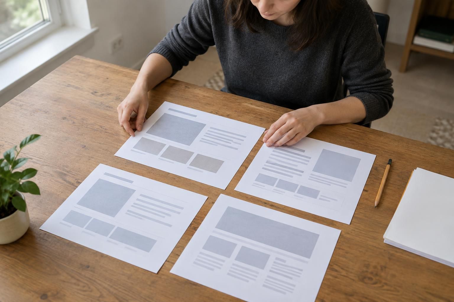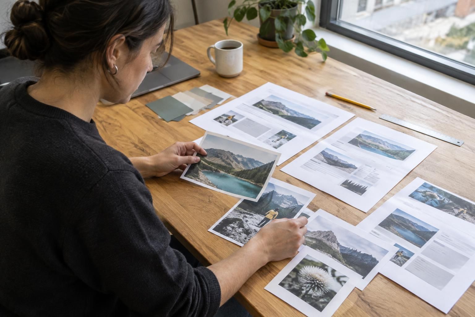
Set image limits by role, then verify the files the site actually serves at real display sizes. A practical budget protects image clarity while catching oversized uploads, unnecessary dimensions, and delivery behavior that makes key pages feel slow. Begin with a small group of representative pages, measure their images, and use the findings to set limits editors and developers can apply.
Set limits by image role, not by one magic number
A useful website image budget is a set of limits tied to what each image does. A wide hero photograph, a small product thumbnail, and an icon have different visual jobs; one file-size ceiling for all three either wastes bandwidth or makes important images look poor.
Start with representative templates and classify images as prominent, supporting, or interface assets. For each role, set an initial maximum file size and pixel dimensions, then test against the design. These limits are working rules for your site, not universal standards. The aim is to prevent avoidable weight while preserving the detail visitors need.
- Prominent images: largest visual areas, where composition and sharpness matter.
- Supporting images: article, product, or service content that should remain clear at its displayed size.
- Interface assets: small icons or marks, often better served as compact vector graphics when suitable.
Measure the file visitors receive
A source image's dimensions do not tell the whole story. A 4000-pixel photograph can be unnecessarily large if it is displayed in a 700-pixel content column. Conversely, reducing its file size too far can create visible blocks, banding, or blurred details. Record both the delivered file size and pixel dimensions, along with where the image appears.
Check the browser's actual response rather than relying only on the media library. Responsive image markup can offer different files for different screen widths, but it must be configured correctly. Confirm that a phone receives a suitably sized asset and that a large display is not stretched from an undersized image.
Choose compression and formats with visual review
Compression reduces file weight, but aggressive compression can damage fine texture, gradients, edges, or text embedded in an image. Photographs and illustrations may also respond differently to formats and encoding settings. Treat format selection as an implementation choice to test with your content and supported delivery setup, rather than assuming that one format always wins.
Compare candidate files at the size visitors see, not only zoomed in on an editing screen. Inspect faces, product details, thin lines, and smooth color transitions. If an image communicates a feature or condition, ask someone who knows the subject to judge whether compression has obscured useful information.
Build the budget into publishing and delivery
A limit that exists only in a planning document will eventually be bypassed. Decide where images are resized and compressed: during upload, in a media processing step, or when generating responsive variants. Add validation for unusually large files or dimensions, and give content editors a clear correction path instead of silently accepting poor-quality images or rejecting uploads without explanation.
If the site uses a content management system or custom application, test how it handles existing images, new uploads, and replacements. Verify that generated variants are refreshed when a source image changes, and that cached copies do not continue serving an obsolete file. Keep a deliberate exception process for cases where detail is essential.
Verify the experience, including what is below the fold
Test representative pages on both mobile and desktop with a fresh load. Check whether the largest visible image appears promptly, whether the layout shifts as images arrive, and whether images farther down the page are requested only when appropriate. Lazy loading can reduce early work, but applying it indiscriminately to the main image can make the first view feel slower.
Compare before-and-after measurements for the same page and conditions. Useful observations include the delivered image sizes, when the main image becomes visible, whether the layout moves, and whether quality defects appear. Separate image effects from scripts, fonts, network conditions, and server delays before changing the budget.
Know when a budget is unnecessary or needs an exception
A formal per-role budget may be unnecessary for a small, stable site with few images and no regular publishing workflow. Still, a basic check of dimensions and delivered size can catch an oversized upload. The more useful investment may be correcting a single problematic asset rather than building an elaborate review process.
Use an exception when the image's evidentiary or product detail matters more than a strict weight target. Record why it is needed, where it appears, and how it is delivered. If several exceptions cluster on one template, revisit the template or image presentation instead of repeatedly waiving the same rule.
A practical image-budget checklist
- Record image file size, pixel dimensions, format, and role for important templates.
- Set separate limits for large hero images, content images, and small interface graphics.
- Confirm that delivered dimensions match the largest size the design actually displays.
- Check visual quality on a representative phone and desktop, including crops and text in images.
- Test a cold page load and verify that below-the-fold images do not delay the initial view.
- Repeat checks after content uploads or design changes, and document who owns exceptions.
Questions about this approach
Should every image be resized to the exact width shown on desktop?
No. Resizing a source image to match its largest intended display size can reduce unnecessary pixels, but responsive layouts may need more than one size. Verify the image selected at common viewport widths and avoid enlarging a small source beyond its useful resolution.
Can image optimization be fully automated?
Use automated checks for file weight and dimensions, then review visual quality for prominent or information-bearing images. Automation can flag likely problems, but it cannot reliably judge whether compression has hidden a product feature or damaged an important detail.
How can we tell whether the image budget helped?
Compare the same page before and after changes under similar conditions. Check delivered file sizes, image visibility, layout movement, and quality on mobile and desktop. If those improve or remain acceptable while another bottleneck still dominates, avoid claiming the image change solved the entire page-speed issue.
For help applying this approach, explore our Custom Web Design & Website Redesign services.
Discuss your project with Full Blown Studio
Tell us what needs to work better and what you have tried. Discuss your project, email bob@fullblown.com, or call (661) 429-0940.