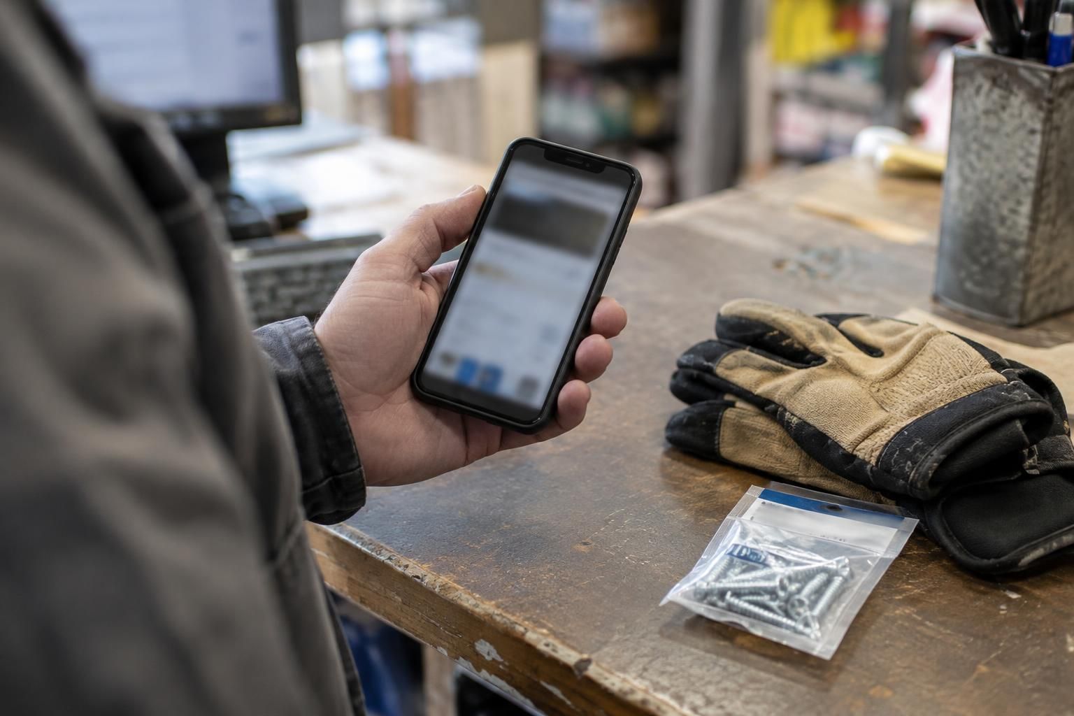
Mobile usability for a service business is chiefly about whether a customer can find the right service and make contact on a phone. Prioritize clear navigation, reliable call actions, and forms that are easy to complete, then test the request all the way through to the team that receives it.
Treat mobile usability as a contact-path problem
For a service business, mobile usability means helping someone find the right service, understand whether the business can help, and make contact without avoidable effort. The main barriers are often small: an unclear menu, a phone number that is not tappable, or a form that is difficult to finish with one hand.
Start with the tasks customers actually need to complete, rather than judging the site by whether it shrinks to fit a phone. A usable layout is not automatically a usable journey. Trace what happens from the first page to a call, request, or other intended contact action.
Make navigation answer the customer’s next question
A mobile menu can fail when its labels describe the company’s internal organization instead of customer needs. Vague items such as “Solutions” may leave a visitor unsure where to find a specific repair, service area, or way to request help. Keep labels concise and recognizable, and give the highest-priority tasks a clear route from the pages where customers are likely to arrive.
Menus also need predictable behavior. The menu control should be easy to tap, expose whether the menu is open, and let a person close it without hunting for a tiny icon. Avoid a layout where an open menu covers the page but provides no obvious way back. If contact details are central to the task, make a call action easy to find without forcing every visitor into the same path.
Test with a narrow screen and with larger text settings. Check that the menu does not cover a form’s submit button, trap keyboard users, or require precision taps. A short menu is not inherently better if it hides pages customers need to make a decision.
Remove friction from phone and contact actions
A displayed phone number should behave like a phone number on a mobile device: tapping it should offer a call, not select text or open an unrelated page. Verify the number, business hours, and destination. If calls are not always the right channel, offer a clear alternative such as a request form or email link, rather than making visitors guess.
Tap targets matter most where people are moving quickly or using one hand. Links that sit close together can lead to accidental navigation; icons without text may be hard to interpret. Use enough spacing and clear labels for actions such as “Call” or “Request service.” Do not rely on color alone to indicate which text is interactive.
Check the full context around the action. A call button may be technically tappable but still unhelpful if the page does not say what service is offered, where the business works, or when a response can be expected.
Design forms for thumbs, keyboards, and interruptions
On a phone, a form competes with the on-screen keyboard and limited space. Ask only for information the team needs to route and respond to the request. Use labels that remain visible after someone starts typing; placeholder text alone can disappear and leave the field’s purpose unclear. Choose appropriate input types so a phone number or email address brings up a useful keyboard.
Validation should help people recover. Identify a missing or invalid field in plain language, place the message near that field, and preserve the other entries when possible. Make required fields clear before submission. When a form succeeds, confirm what happened; if sending fails, explain how to try again or use another contact method.
Do not assume a single successful test proves the form works. Try short and long names, different phone formats, keyboard navigation, and a submission with an error. Check whether the submit control remains visible and usable when the keyboard is open, and whether a slow response causes duplicate submissions.
Follow the request beyond the screen
A mobile form is part of an operational process, not just a page element. Confirm where submissions go, who owns them, and what happens if an email notification or connected system is unavailable. If the site passes requests to a customer-management system, verify field mapping and failure handling so a valid inquiry is not silently lost.
Consider what information is appropriate to collect and who can access it. Avoid asking for sensitive details that are not needed for an initial contact. If the site gives an immediate confirmation, make sure it reflects the actual submission state rather than appearing before the request has been accepted.
When evaluating a change, measure the steps that expose friction: menu use, form starts and completions, validation errors, failed submissions, and contact actions by device. Interpret those signals alongside customer feedback and operational records. A rise or fall in one metric does not by itself explain why people behaved that way.
Test real journeys before and after changes
Use actual devices where possible, not only a desktop browser’s responsive preview. Test common screen widths, touch input, text enlargement, and keyboard-only navigation. Walk through the site as someone who has landed directly on a service page from search, since not every visitor begins at the homepage.
A useful test includes both a successful path and likely failure points: opening and closing the menu, correcting a field, returning from the keyboard, tapping a call link, and recovering from a failed submission. Ask someone unfamiliar with the site to find a service and make contact. Observe where they pause or choose the wrong control instead of explaining the design to them.
After implementation, repeat the same tasks and confirm the receiving team sees a correctly routed request. Mobile usability is maintained through changes to services, staff, forms, and integrations; include these contact paths in routine website checks.
Mobile contact-path review
- Use a phone-sized device to complete each main customer task, including calling, requesting service, and finding service-area details.
- Check that navigation labels are specific, the menu opens and closes predictably, and important pages are reachable without excessive tapping.
- Test phone, email, and location links with the device’s normal apps and confirm they contain the right business information.
- Submit forms with valid, missing, and incorrectly formatted values; verify useful errors, retained entries, and a clear success state.
- Check keyboard access, visible focus, readable text, adequate tap targets, and whether the form remains usable when the on-screen keyboard appears.
- Confirm that submissions reach the intended team or system, and test the confirmation and recovery path if sending fails.
Questions about this approach
Is a responsive website automatically easy to use on a phone?
A responsive layout adapts to screen size, but that does not guarantee that menu labels make sense, tap targets are easy to use, or forms work well with a phone keyboard. Test customer tasks directly on mobile.
How many fields should a mobile service form have?
Collect only what the team needs to respond and route the request. The right fields depend on the service and workflow; avoid adding questions simply because they might be useful later.
How can we check that a mobile call button works?
Test the link on common mobile devices and confirm it opens the expected calling option with the correct number. Also provide a clear alternative contact method if calling is not suitable for every customer.
For help applying this approach to your systems, explore our custom web design & website redesign services.
Discuss your project with Full Blown Studio
Tell us what needs to work better. Request a free project consultation, email bob@fullblown.com, or call (661) 429-0940.